Wondering how your logo performs? 🧐
Get professional logo reviews in seconds and catch design issues in time.
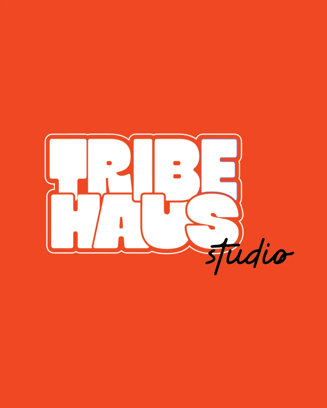
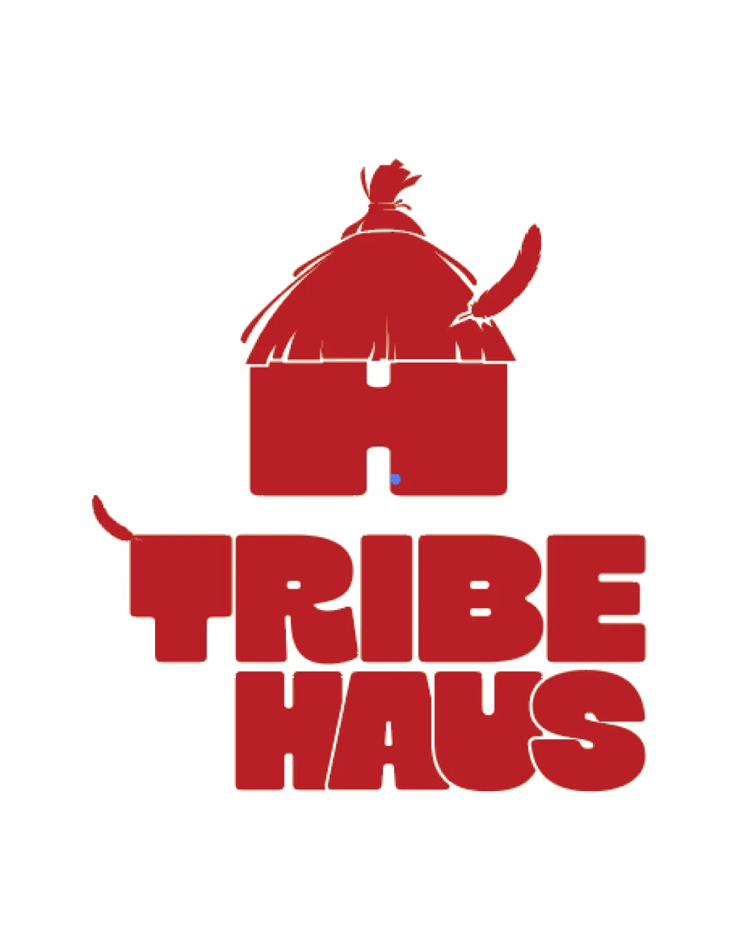
Try it Now!Logo review of TRIBE HAUS
 Logo analysis by AI
Logo type:
Style:
Detected symbol:
Detected text:
Business industry:
Review requested by Apxdzine
**If AI can recognize or misinterpret it, so can people.
Structured logo review
Legibility
![]() Text is bold and readable at most sizes.
Text is bold and readable at most sizes.![]() Consistent letter spacing supports quick recognition.
Consistent letter spacing supports quick recognition.
![]() Decorative elements (tails/feathers) interfere slightly with the 'T' and may reduce clarity for some audiences.
Decorative elements (tails/feathers) interfere slightly with the 'T' and may reduce clarity for some audiences.
Scalability versatility
![]() Bold lines withstand reduction for use on mediums such as signage and packaging.
Bold lines withstand reduction for use on mediums such as signage and packaging.![]() Single color scheme aids visibility.
Single color scheme aids visibility.
![]() Thin roof and feather details on the hut risk losing definition at small sizes, making it problematic for applications like favicons or embossing.
Thin roof and feather details on the hut risk losing definition at small sizes, making it problematic for applications like favicons or embossing.![]() Decorative accents may blur in embroidery or small digital formats.
Decorative accents may blur in embroidery or small digital formats.
200x250 px
100×125 px
50×62 px
Balance alignment
![]() Logo creates a stable vertical arrangement from symbol to wordmark.
Logo creates a stable vertical arrangement from symbol to wordmark.![]() Heavy typography supports visual weight at the base.
Heavy typography supports visual weight at the base.
![]() Symbol size compared to text feels top-heavy.
Symbol size compared to text feels top-heavy.![]() Feather/tail accents on both the hut and 'T' introduce visual imbalance on the left and upper right.
Feather/tail accents on both the hut and 'T' introduce visual imbalance on the left and upper right.

Originality
![]() Strong integration of letter 'H' as a hut shape is creative.
Strong integration of letter 'H' as a hut shape is creative.![]() Custom negative detail and tribal cues in the illustration stand out.
Custom negative detail and tribal cues in the illustration stand out.
![]() Feather motif is somewhat expected for 'tribe' branding and not entirely unique.
Feather motif is somewhat expected for 'tribe' branding and not entirely unique.
Logomark wordmark fit
![]() Wordmark and logomark share a thick, chunky feel for some cohesion.
Wordmark and logomark share a thick, chunky feel for some cohesion.
![]() Thatch and feather details of the logomark are more organic and illustrative than the geometric, blocky wordmark, producing a stylistic disconnect.
Thatch and feather details of the logomark are more organic and illustrative than the geometric, blocky wordmark, producing a stylistic disconnect.
Aesthetic look
![]() Bold color and forms deliver strong visual impact.
Bold color and forms deliver strong visual impact.![]() Energetic, playful attitude aligns with the likely brand personality.
Energetic, playful attitude aligns with the likely brand personality.
![]() Busy details (tail, feather, roof fringe) may make logo feel less modern and more cluttered.
Busy details (tail, feather, roof fringe) may make logo feel less modern and more cluttered.
Dual meaning and misinterpretations
![]() No inappropriate or confusing dual-meanings detected in overall composition.
No inappropriate or confusing dual-meanings detected in overall composition.
Color harmony
![]() Single dominant color (#BF1E2E) provides solid brand recognition and harmonious unity.
Single dominant color (#BF1E2E) provides solid brand recognition and harmonious unity.![]() High contrast on white background aids clarity.
High contrast on white background aids clarity.
Firebrick
#BF1E2E
White
#FFFFFF