Wondering how your logo performs? 🧐
Get professional logo reviews in seconds and catch design issues in time.
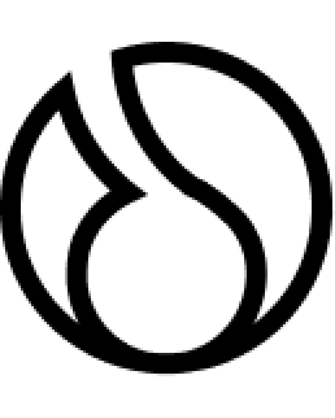
Try it Now!Logo review of abstract circular design with intersecting lines, ..
 Logo analysis by AI
Logo type:
Style:
Detected symbol:
Negative space:
Business industry:
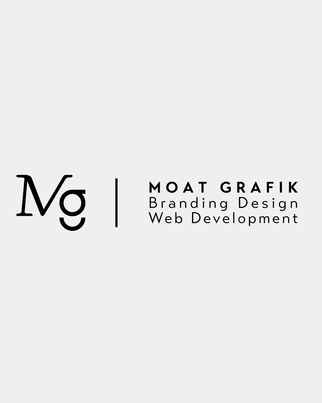
Review requested by Natalia.szwed
**If AI can recognize or misinterpret it, so can people.
Structured logo review
Scalability versatility
![]() Bold simple lines ensure good visibility at small and large sizes.
Bold simple lines ensure good visibility at small and large sizes.![]() Single-color design works well across multiple applications such as signage, digital, and print.
Single-color design works well across multiple applications such as signage, digital, and print.
![]() Extremely thinly detailed areas may lose clarity at very small sizes or in embroidery applications.
Extremely thinly detailed areas may lose clarity at very small sizes or in embroidery applications.
200x250 px
100×125 px
50×62 px
Balance alignment
![]() Logo is highly symmetrical and visually balanced.
Logo is highly symmetrical and visually balanced.![]() Shape alignment within the circle is harmonious and intentional.
Shape alignment within the circle is harmonious and intentional.

Originality
![]() Abstract use of lines and negative space provides some uniqueness.
Abstract use of lines and negative space provides some uniqueness.
![]() Circular abstract motifs with leaf/droplet themes are very common in sustainability and eco branding, making the core concept feel derivative.
Circular abstract motifs with leaf/droplet themes are very common in sustainability and eco branding, making the core concept feel derivative.
Aesthetic look
![]() Clean, minimal look gives a modern and professional appearance.
Clean, minimal look gives a modern and professional appearance.![]() Logo avoids unnecessary embellishments and maintains a crisp aesthetic.
Logo avoids unnecessary embellishments and maintains a crisp aesthetic.
![]() Simplicity comes at the expense of distinctiveness; the form may blend in with similar abstract marks.
Simplicity comes at the expense of distinctiveness; the form may blend in with similar abstract marks.
Dual meaning and misinterpretations
![]() No inappropriate or misinterpreted imagery detected.
No inappropriate or misinterpreted imagery detected.![]() Entire composition is abstract yet neutral.
Entire composition is abstract yet neutral.
Color harmony
![]() Monochromatic palette ensures universal applicability and prevents color clashes.
Monochromatic palette ensures universal applicability and prevents color clashes.![]() High contrast between logo and background supports clear visibility.
High contrast between logo and background supports clear visibility.
Black
#000000
White
#FFFFFF