Wondering how your logo performs? 🧐
Get professional logo reviews in seconds and catch design issues in time.
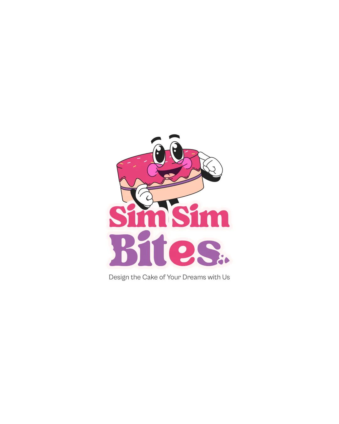
Try it Now!Logo review of Sim Sim Bites. Design the Cake of Your Dreams with..
 Logo analysis by AI
Logo type:
Style:
Detected symbol:
Detected text:
Business industry:
Review requested by Mubeen
**If AI can recognize or misinterpret it, so can people.
Structured logo review
Legibility
![]() 'Sim Sim Bites.' text is bold and easy to read.
'Sim Sim Bites.' text is bold and easy to read.![]() Font choice suits playful nature.
Font choice suits playful nature.![]() Tagline is somewhat legible at larger sizes.
Tagline is somewhat legible at larger sizes.
![]() Tagline becomes illegible when scaled down; lacks sufficient contrast and is very thin.
Tagline becomes illegible when scaled down; lacks sufficient contrast and is very thin.![]() Mixing colors (pink and purple) in 'Bites.' reduces coherence slightly.
Mixing colors (pink and purple) in 'Bites.' reduces coherence slightly.
Scalability versatility
![]() Logo will stand out visually on large prints like banners or packaging.
Logo will stand out visually on large prints like banners or packaging.![]() Illustrative character aids in brand recognition.
Illustrative character aids in brand recognition.
![]() Too detailed and illustrative for small applications like business cards, favicons, or embroidery—details in the face and arms will be lost.
Too detailed and illustrative for small applications like business cards, favicons, or embroidery—details in the face and arms will be lost.![]() Tagline is unreadable at small sizes.
Tagline is unreadable at small sizes.![]() Complex colors and shading hinder adaptability across all media.
Complex colors and shading hinder adaptability across all media.
200x250 px
100×125 px
50×62 px
Balance alignment
![]() Main symbol is centered above wordmark; playful stacking adds whimsical charm.
Main symbol is centered above wordmark; playful stacking adds whimsical charm.
![]() The size and expressiveness of the cake character outweighs the text below, creating a slight imbalance.
The size and expressiveness of the cake character outweighs the text below, creating a slight imbalance.![]() Tagline is too small relative to the rest of the logo and feels almost like an afterthought.
Tagline is too small relative to the rest of the logo and feels almost like an afterthought.

Originality
![]() Cartoon cake with arms and lively facial features is unique and memorable.
Cartoon cake with arms and lively facial features is unique and memorable.![]() Expressive eyes add a distinct personality.
Expressive eyes add a distinct personality.
![]() Concept of a smiling cake is fun but not exceptionally novel for a bakery/cake brand.
Concept of a smiling cake is fun but not exceptionally novel for a bakery/cake brand.![]() Does not use negative space or clever visual puns.
Does not use negative space or clever visual puns.
Logomark wordmark fit
![]() Symbol style matches playful, rounded typeface; both evoke a friendly feeling.
Symbol style matches playful, rounded typeface; both evoke a friendly feeling.
![]() Symbol feels heavier and more detailed than the flat text, diminishing harmony. Text styles differ between 'Sim Sim' and 'Bites.' with little integration.
Symbol feels heavier and more detailed than the flat text, diminishing harmony. Text styles differ between 'Sim Sim' and 'Bites.' with little integration.
Aesthetic look
![]() Whimsical style and bold colors are visually engaging and appealing to a young/family audience.
Whimsical style and bold colors are visually engaging and appealing to a young/family audience.![]() Well-executed cartoon effect.
Well-executed cartoon effect.
![]() Aesthetic risks being perceived as too childish, alienating more sophisticated or mature markets.
Aesthetic risks being perceived as too childish, alienating more sophisticated or mature markets.![]() Color transitions are abrupt between 'Sim Sim' and 'Bites.'
Color transitions are abrupt between 'Sim Sim' and 'Bites.'![]() Busy look due to multiple design elements.
Busy look due to multiple design elements.
Dual meaning and misinterpretations
![]() Logo conveys intended cake and fun vibe without any unintended or inappropriate connotations.
Logo conveys intended cake and fun vibe without any unintended or inappropriate connotations.
Color harmony
![]() Two dominant hues provide playful, energetic contrast.
Two dominant hues provide playful, energetic contrast.![]() Pink and purple represent sweetness; colors are appropriate for cakes and desserts.
Pink and purple represent sweetness; colors are appropriate for cakes and desserts.
![]() Slightly abrupt jump between 'Sim Sim' pink and 'Bites.' purple may look inconsistent.
Slightly abrupt jump between 'Sim Sim' pink and 'Bites.' purple may look inconsistent.![]() Use of light peach and white may disappear on certain backgrounds; shadow effect looks heavy at small scale.
Use of light peach and white may disappear on certain backgrounds; shadow effect looks heavy at small scale.
Cerise Pink
#EA4B9A
Lavender Purple
#B37ED9
Light Peach
#F9E0C8
White
#FFFFFF
Charcoal
#4A4A4A