Wondering how your logo performs? 🧐
Get professional logo reviews in seconds and catch design issues in time.
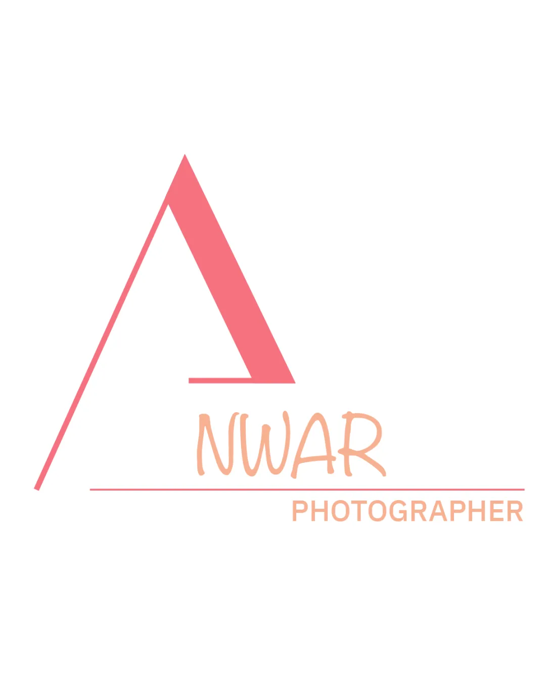
Try it Now!Logo review of NWAR PHOTOGRAPHER
 Logo analysis by AI
Logo type:
Style:
Detected symbol:
Detected text:
Business industry:
Review requested by I.ft19
**If AI can recognize or misinterpret it, so can people.
Structured logo review
Legibility
![]() Text 'NWAR' and 'PHOTOGRAPHER' are mostly clear and readable
Text 'NWAR' and 'PHOTOGRAPHER' are mostly clear and readable![]() Font contrast (handwritten vs. geometric) adds some personality
Font contrast (handwritten vs. geometric) adds some personality
![]() 'NWAR' uses a handwritten typeface that is slightly less professional
'NWAR' uses a handwritten typeface that is slightly less professional![]() Light peach color reduces readability on white background, especially when scaled down
Light peach color reduces readability on white background, especially when scaled down
Scalability versatility
![]() Simple geometric form is generally scalable
Simple geometric form is generally scalable![]() Works well on large applications like signage and banners
Works well on large applications like signage and banners
![]() Thin line in the large 'A' symbol may lose visibility at smaller sizes or embroidery
Thin line in the large 'A' symbol may lose visibility at smaller sizes or embroidery![]() Color contrast of text is weak when scaled down or printed in black and white
Color contrast of text is weak when scaled down or printed in black and white
200x250 px
100×125 px
50×62 px
Balance alignment
![]() Logo uses horizontal line to create visual separation between symbol and wordmark
Logo uses horizontal line to create visual separation between symbol and wordmark![]() The central alignment mostly balances the symbol with the text
The central alignment mostly balances the symbol with the text
![]() Large 'A' symbol dominates and overpowers the wordmark, creating imbalance
Large 'A' symbol dominates and overpowers the wordmark, creating imbalance![]() 'PHOTOGRAPHER' is off to the right, disrupting the visual symmetry
'PHOTOGRAPHER' is off to the right, disrupting the visual symmetry

Originality
![]() Geometric approach to the 'A' symbol adds some distinctiveness
Geometric approach to the 'A' symbol adds some distinctiveness![]() Combination of styles (geometric and handwritten) is less generic
Combination of styles (geometric and handwritten) is less generic
![]() 'A' as an initial with minimal abstraction is fairly common
'A' as an initial with minimal abstraction is fairly common![]() 'PHOTOGRAPHER' in a generic sans serif brings down overall uniqueness
'PHOTOGRAPHER' in a generic sans serif brings down overall uniqueness
Logomark wordmark fit
![]() Intended integration of symbol and wordmark with baseline line
Intended integration of symbol and wordmark with baseline line
![]() Styles clash: playful handwritten 'NWAR' vs. strict geometric and sans-serif elements
Styles clash: playful handwritten 'NWAR' vs. strict geometric and sans-serif elements![]() Disproportionate sizing weakens the connection between symbol and wordmark
Disproportionate sizing weakens the connection between symbol and wordmark
Aesthetic look
![]() Minimal color palette creates a unified look
Minimal color palette creates a unified look![]() Modern style is visually appealing
Modern style is visually appealing
![]() Harsh contrast between geometric and handwritten styles feels unresolved
Harsh contrast between geometric and handwritten styles feels unresolved![]() 'A' symbol feels disconnected and unrelated to photography
'A' symbol feels disconnected and unrelated to photography
Dual meaning and misinterpretations
![]() No inappropriate or misleading visual elements detected
No inappropriate or misleading visual elements detected
Color harmony
![]() Palette is limited and not overwhelming
Palette is limited and not overwhelming![]() Colors are cohesive and gentle
Colors are cohesive and gentle
![]() Low contrast between peach text and white background hurts readability
Low contrast between peach text and white background hurts readability![]() Color differentiation between elements is insufficient for clear hierarchy
Color differentiation between elements is insufficient for clear hierarchy
Light Red
#F37180
Light Peach
#F9B898
White
#FFFFFF