Wondering how your logo performs? 🧐
Get professional logo reviews in seconds and catch design issues in time.
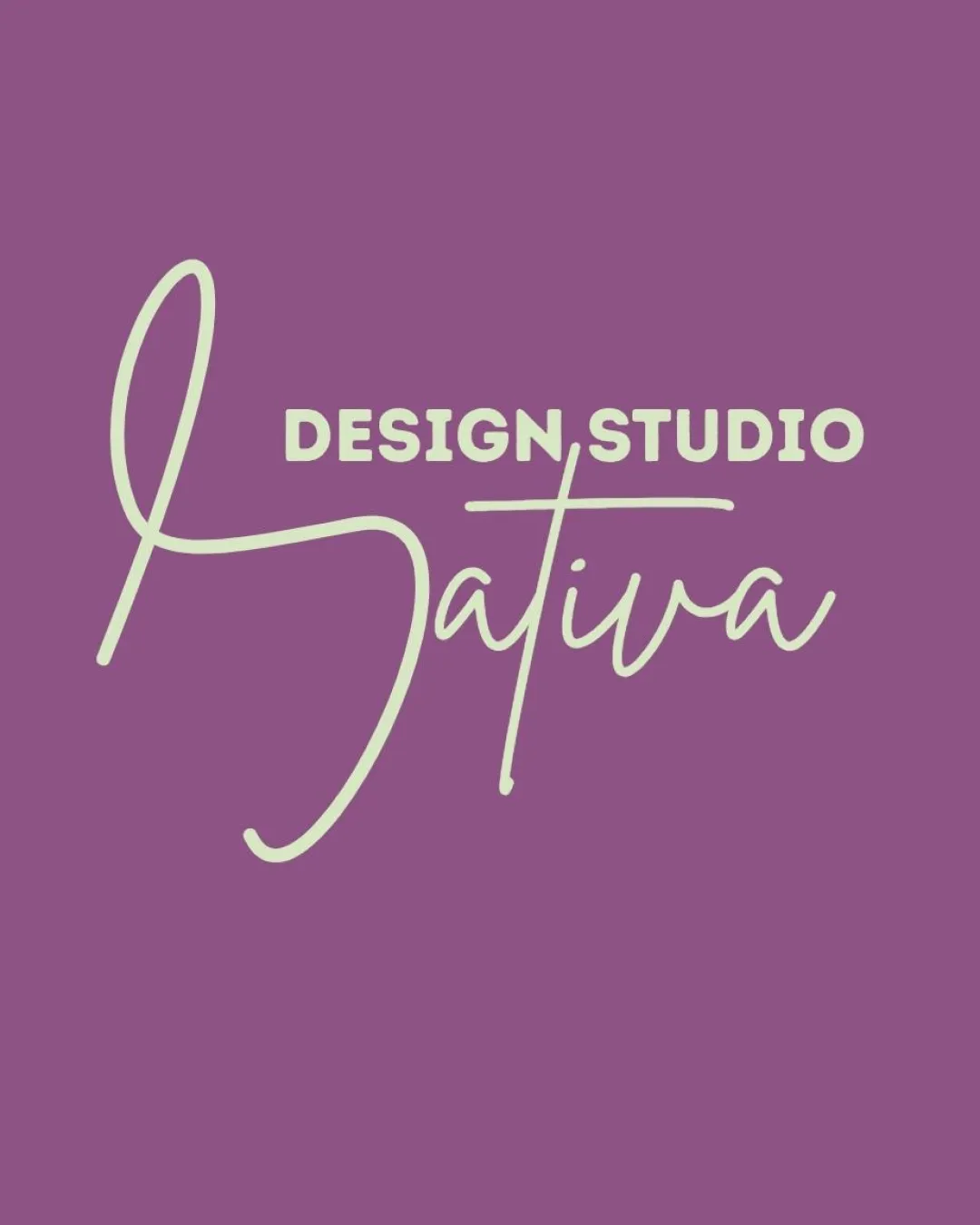
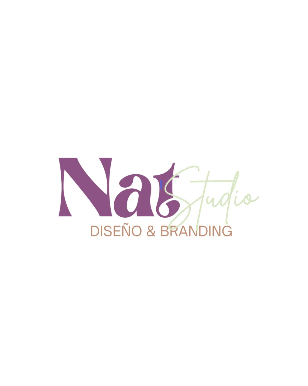
Try it Now!Logo review of Nat Studio DISEÑO & BRANDING
 Logo analysis by AI
Logo type:
Style:
Detected text:
Business industry:
Review requested by Nativadesignstudio
**If AI can recognize or misinterpret it, so can people.
Structured logo review
Legibility
![]() Main word 'Nat' is fairly readable due to strong serif typeface.
Main word 'Nat' is fairly readable due to strong serif typeface.![]() 'DISEÑO & BRANDING' subheading uses a clear sans serif font.
'DISEÑO & BRANDING' subheading uses a clear sans serif font.
![]() 'Studio' script overlaps and blends with 'Nat', reducing legibility.
'Studio' script overlaps and blends with 'Nat', reducing legibility.![]() Light pastel color for 'Studio' lacks adequate contrast on white, making it hard to read at smaller sizes.
Light pastel color for 'Studio' lacks adequate contrast on white, making it hard to read at smaller sizes.![]() Letterforms in 'Nat' are unconventional, which may hinder quick recognition.
Letterforms in 'Nat' are unconventional, which may hinder quick recognition.
Scalability versatility
![]() Simple background allows focus on the logo elements.
Simple background allows focus on the logo elements.![]() Would reproduce well on web and larger print formats.
Would reproduce well on web and larger print formats.
![]() Delicate script of 'Studio' would disappear or blur in small-scale uses, like business cards or favicons.
Delicate script of 'Studio' would disappear or blur in small-scale uses, like business cards or favicons.![]() Complex overlapping of fonts hinders clear embroidery or very small merchandising applications.
Complex overlapping of fonts hinders clear embroidery or very small merchandising applications.![]() Three distinct type styles may not reproduce cohesively in one-color (monochrome) versions.
Three distinct type styles may not reproduce cohesively in one-color (monochrome) versions.
200x250 px
100×125 px
50×62 px
Balance alignment
![]() 'Nat' anchors the mark visually through heavy weight and bold serif forms.
'Nat' anchors the mark visually through heavy weight and bold serif forms.
![]() Script 'Studio' feels off-balance, floating and disconnected from the rest of the visual stack.
Script 'Studio' feels off-balance, floating and disconnected from the rest of the visual stack.![]() The subheading is aligned well horizontally but does not vertically harmonize with the two main elements above.
The subheading is aligned well horizontally but does not vertically harmonize with the two main elements above.

Originality
![]() Combines classic serif with modern script for a distinctive, personalized look.
Combines classic serif with modern script for a distinctive, personalized look.![]() Unusual letterforms and type pairing achieve some visual uniqueness for the mark.
Unusual letterforms and type pairing achieve some visual uniqueness for the mark.
![]() Mixing styles is relatively common in the design/branding space.
Mixing styles is relatively common in the design/branding space.![]() No iconic symbol or abstract mark—relies entirely on typographic treatment.
No iconic symbol or abstract mark—relies entirely on typographic treatment.
Logomark wordmark fit
![]() Script is conceptually relevant for a creative studio.
Script is conceptually relevant for a creative studio.
![]() Script style and color choice clash with the weighty serif, causing a lack of cohesion.
Script style and color choice clash with the weighty serif, causing a lack of cohesion.![]() Scaling and visual weight make 'Studio' feel more like an afterthought, rather than part of an integrated identity.
Scaling and visual weight make 'Studio' feel more like an afterthought, rather than part of an integrated identity.
Aesthetic look
![]() Muted color palette feels calm and modern.
Muted color palette feels calm and modern.![]() Playful type choices suit a creative industry.
Playful type choices suit a creative industry.
![]() Overall look appears disjointed and struggles with consistency.
Overall look appears disjointed and struggles with consistency.![]() Script overlays and weight differences might give a busy, amateur feel compared to a well-harmonized logotype.
Script overlays and weight differences might give a busy, amateur feel compared to a well-harmonized logotype.
Dual meaning and misinterpretations
![]() No inappropriate or accidental imagery detected.
No inappropriate or accidental imagery detected.
Color harmony
![]() Earthy purple and muted green complement each other and suit a creative studio vibe.
Earthy purple and muted green complement each other and suit a creative studio vibe.![]() Reasonable contrast between main word and background.
Reasonable contrast between main word and background.
![]() Pale green for 'Studio' may not be suitable for all backgrounds and lacks punch.
Pale green for 'Studio' may not be suitable for all backgrounds and lacks punch.
Trendy Purple
#936694
Spring Rain
#CCD8B2
Burnished Gold
#AE836F
White
#FFFFFF