Wondering how your logo performs? 🧐
Get professional logo reviews in seconds and catch design issues in time.
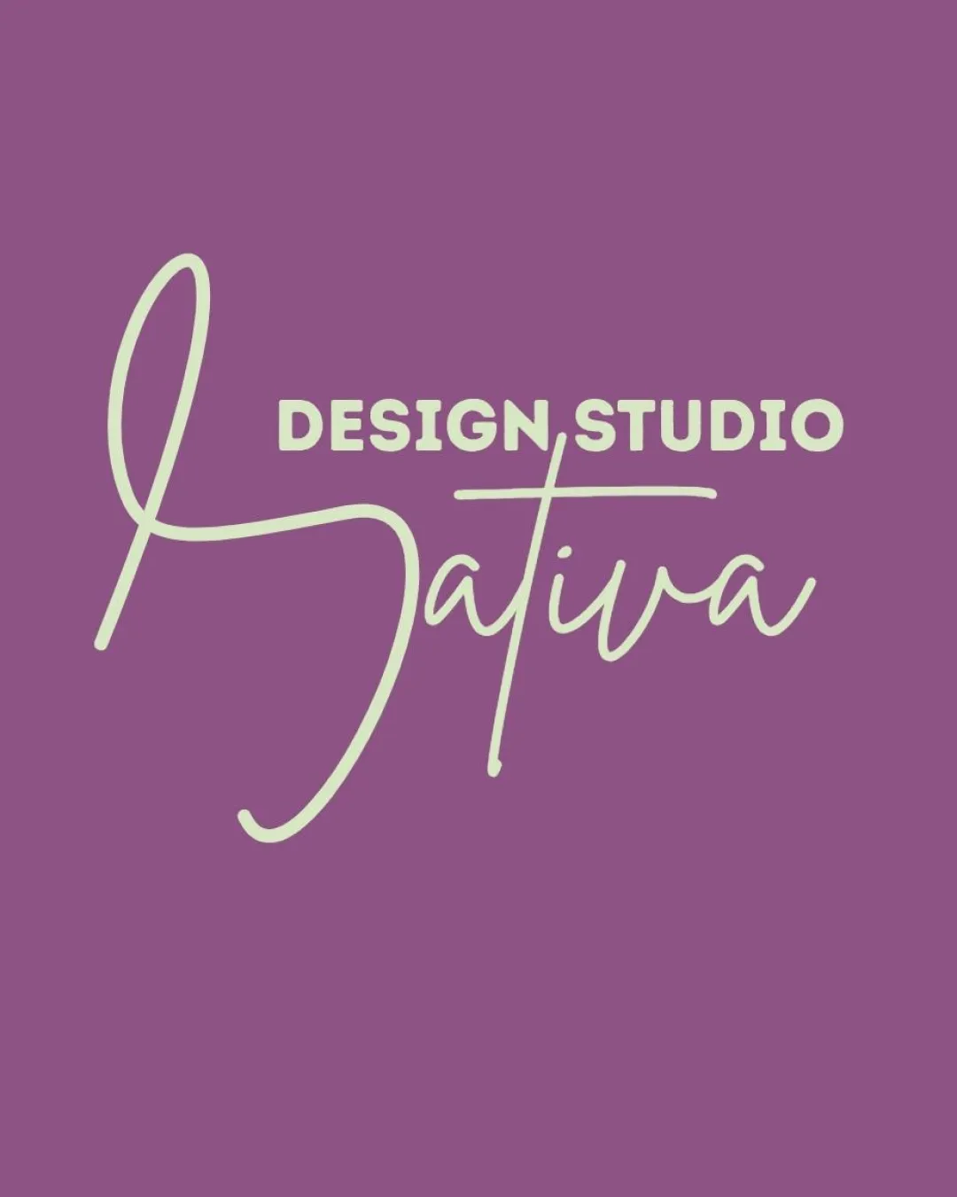
Try it Now!Logo review of DESIGN STUDIO Sativa
 Logo analysis by AI
Logo type:
Style:
Detected symbol:
Detected text:
Business industry:
Review requested by Nativadesignstudio
**If AI can recognize or misinterpret it, so can people.
Structured logo review
Legibility
![]() Uppercase sans-serif 'DESIGN STUDIO' is clear and readable.
Uppercase sans-serif 'DESIGN STUDIO' is clear and readable.![]() Script 'Sativa' is mostly legible and stylish, reflecting modern design values.
Script 'Sativa' is mostly legible and stylish, reflecting modern design values.
![]() Script font for 'Sativa' may be difficult to read quickly, especially from a distance or at small sizes.
Script font for 'Sativa' may be difficult to read quickly, especially from a distance or at small sizes.![]() Large flourish on 'S' could be mistaken for another letter or misread.
Large flourish on 'S' could be mistaken for another letter or misread.
Scalability versatility
![]() Simple two-tone color scheme enhances print versatility.
Simple two-tone color scheme enhances print versatility.![]() Would work well on digital banners, shop signage, and packaging.
Would work well on digital banners, shop signage, and packaging.
![]() Thin script lines in 'Sativa' may disappear at small sizes (e.g. business cards, app icons).
Thin script lines in 'Sativa' may disappear at small sizes (e.g. business cards, app icons).![]() Highly decorative initial 'S' creates scaling issues for embroidery or very small formats.
Highly decorative initial 'S' creates scaling issues for embroidery or very small formats.
200x250 px
100×125 px
50×62 px
Balance alignment
![]() Good visual contrast between 'DESIGN STUDIO' and 'Sativa', establishing clear hierarchy.
Good visual contrast between 'DESIGN STUDIO' and 'Sativa', establishing clear hierarchy.![]() Boldness of 'DESIGN STUDIO' supports the script below.
Boldness of 'DESIGN STUDIO' supports the script below.
![]() Large sweeping 'S' causes visual imbalance, drawing too much weight to the left.
Large sweeping 'S' causes visual imbalance, drawing too much weight to the left.![]() Alignment between 'DESIGN STUDIO' and the script baseline lacks cohesion; feels disconnected.
Alignment between 'DESIGN STUDIO' and the script baseline lacks cohesion; feels disconnected.

Originality
![]() Elegant handwritten script provides unique character.
Elegant handwritten script provides unique character.![]() Distinctive mix of fonts with a stylish, personalized feel.
Distinctive mix of fonts with a stylish, personalized feel.
![]() Script style is trendy and common among boutique studios, reducing uniqueness.
Script style is trendy and common among boutique studios, reducing uniqueness.
Logomark wordmark fit
![]() Fonts contrast yet complement each other visually, providing clear separation of roles.
Fonts contrast yet complement each other visually, providing clear separation of roles.![]() Both styles support the creative/modern industry image.
Both styles support the creative/modern industry image.
![]() Mismatched style intensity: bold 'DESIGN STUDIO' somewhat overpowers the delicate 'Sativa' script.
Mismatched style intensity: bold 'DESIGN STUDIO' somewhat overpowers the delicate 'Sativa' script.
Aesthetic look
![]() Visually pleasing color combination works for modern creative branding.
Visually pleasing color combination works for modern creative branding.![]() Provides an elegant, approachable look suitable for a design studio.
Provides an elegant, approachable look suitable for a design studio.
![]() Flourished 'S' appears oversized and slightly disruptive.
Flourished 'S' appears oversized and slightly disruptive.
Dual meaning and misinterpretations
![]() No inappropriate symbols or unintended interpretations detected.
No inappropriate symbols or unintended interpretations detected.
Color harmony
![]() Restrained, harmonious two-color palette works well together.
Restrained, harmonious two-color palette works well together.![]() Creates clean, professional contrast without overwhelming the eye.
Creates clean, professional contrast without overwhelming the eye.
Royal Heather
#8A4F93
Pale Dust
#EDEADE