 View review
Logo score
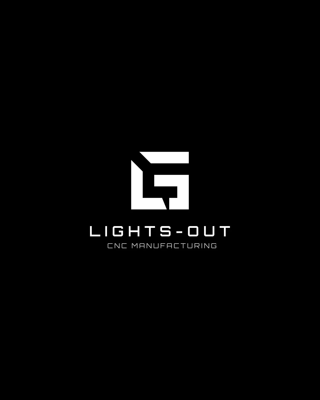
Logo review ofLights Out Cnc Manufacturing
Review the detailed scores below to see what is working and what should be refined first.
Legibility
Originality
Color
Balance
Scale
Detailed review
Logo performance breakdown
Legibility
![]() Text is highly readable due to excellent contrast with the background.
Text is highly readable due to excellent contrast with the background.![]() Font selection is clean and straightforward, suitable for industrial branding.
Font selection is clean and straightforward, suitable for industrial branding.![]() Consistent spacing aids clarity and professionalism.
Consistent spacing aids clarity and professionalism.
Originality
![]() Combining 'L' and 'O' into a single symbol is a clever custom approach, relevant to the name.
Combining 'L' and 'O' into a single symbol is a clever custom approach, relevant to the name.![]() Abstracted geometric shapes feel tailored for manufacturing and mechanical themes.
Abstracted geometric shapes feel tailored for manufacturing and mechanical themes.
![]() Letterform fusion concept is not entirely unique, appears in many industrial logos; could push abstraction further for full originality.
Letterform fusion concept is not entirely unique, appears in many industrial logos; could push abstraction further for full originality.
Color harmony
![]() Strict black and white palette is classic and highly effective.
Strict black and white palette is classic and highly effective.![]() Strong contrast ensures easy reproduction across applications.
Strong contrast ensures easy reproduction across applications.![]() Colors emphasize the high-tech, efficient ethos of CNC manufacturing.
Colors emphasize the high-tech, efficient ethos of CNC manufacturing.
White
#FFFFFF
Black
#000000
Balance alignment
![]() Logo demonstrates strong visual balance between symbol and type elements.
Logo demonstrates strong visual balance between symbol and type elements.![]() Good alignment and spacing in the wordmark/sub-line.
Good alignment and spacing in the wordmark/sub-line.![]() Centralized placement prevents top- or bottom-heavy feel.
Centralized placement prevents top- or bottom-heavy feel.

Scalability
![]() Bold, geometric symbol scales well for larger applications such as signage and packaging.
Bold, geometric symbol scales well for larger applications such as signage and packaging.![]() Minimal detail ensures logo remains recognizable at smaller sizes like business cards.
Minimal detail ensures logo remains recognizable at smaller sizes like business cards.![]() Simple color scheme enhances adaptability.
Simple color scheme enhances adaptability.
![]() Monogram symbol may lose some letter recognition at extremely tiny sizes, such as favicons or embroidery patches.
Monogram symbol may lose some letter recognition at extremely tiny sizes, such as favicons or embroidery patches.
200x250 px
100×125 px
50×62 px
Misinterpretations
![]() No inappropriate or unintended visual meanings detected.
No inappropriate or unintended visual meanings detected.![]() Logo is abstract, precise, and professional.
Logo is abstract, precise, and professional.
Symbol & text fit
![]() Symbol and wordmark share a contemporary, angular style that unifies the brand identity.
Symbol and wordmark share a contemporary, angular style that unifies the brand identity.
![]() Proportions are harmonious; neither element dominates unduly.
Proportions are harmonious; neither element dominates unduly.
Try your own review
Review my logo
Wondering how your logo performs?
Get a clear logo score, key risks, and priority fix ideas before your client or audience sees it.
Keep exploring