Wondering how your logo performs? 🧐
Get professional logo reviews in seconds and catch design issues in time.
Try it Now!Logo review of H
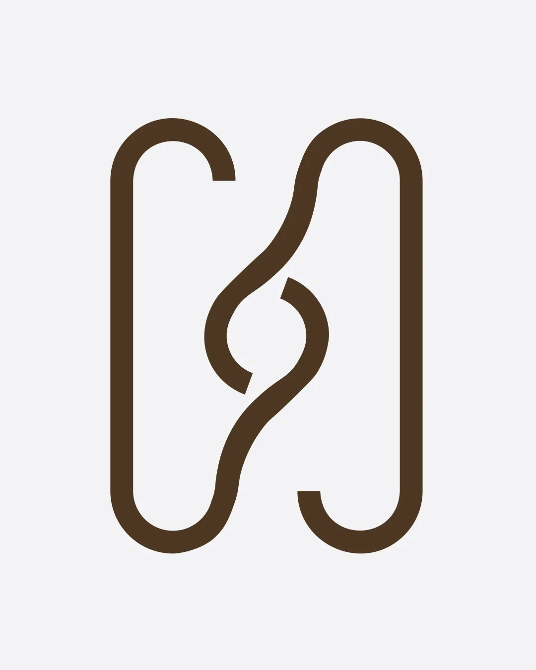
 Logo analysis by AI
Logo type:
Style:
Detected symbol:
Negative space:
Detected text:
Business industry:
Review requested by Olamilekan
**If AI can recognize or misinterpret it, so can people.
Structured logo review
Scalability versatility
Clean, bold linework ensures the symbol will remain legible at very small and very large sizes.
Minimal detail promotes excellent adaptability for business cards, web favicons, and large-scale signage.
Works well as an icon, print element, or embossed mark.

200x250 px

100×125 px

50×62 px
Balance alignment
Symmetrical vertical alignment provides visual stability.
Well-centered composition and clear visual hierarchy.
The abstract, organic curve in the middle has a slight visual tension with the geometric outer lines, which may bother some viewers.


Originality
Creative use of intertwining forms to build a distinctive monogram.
Negative space adds depth and subtle interest.
The overall form resembles other geometric monograms, lacking a clearly unique twist.
Aesthetic look
Minimal and sophisticated aesthetic.
Consistent line widths add to the contemporary feel.
Organic/abstract center may come off as ambiguous and may not immediately convey the intended letterform to all audiences.
Dual meaning and misinterpretations
No inappropriate or confusing double meanings detected in the symbol.
Color harmony
Simple two-color palette maintains high contrast and clarity.
Brown on light gray produces both professionalism and warmth.
Dark Brown
#59422A
Light Gray
#EFEFEF


