Wondering how your logo performs? 🧐
Get professional logo reviews in seconds and catch design issues in time.
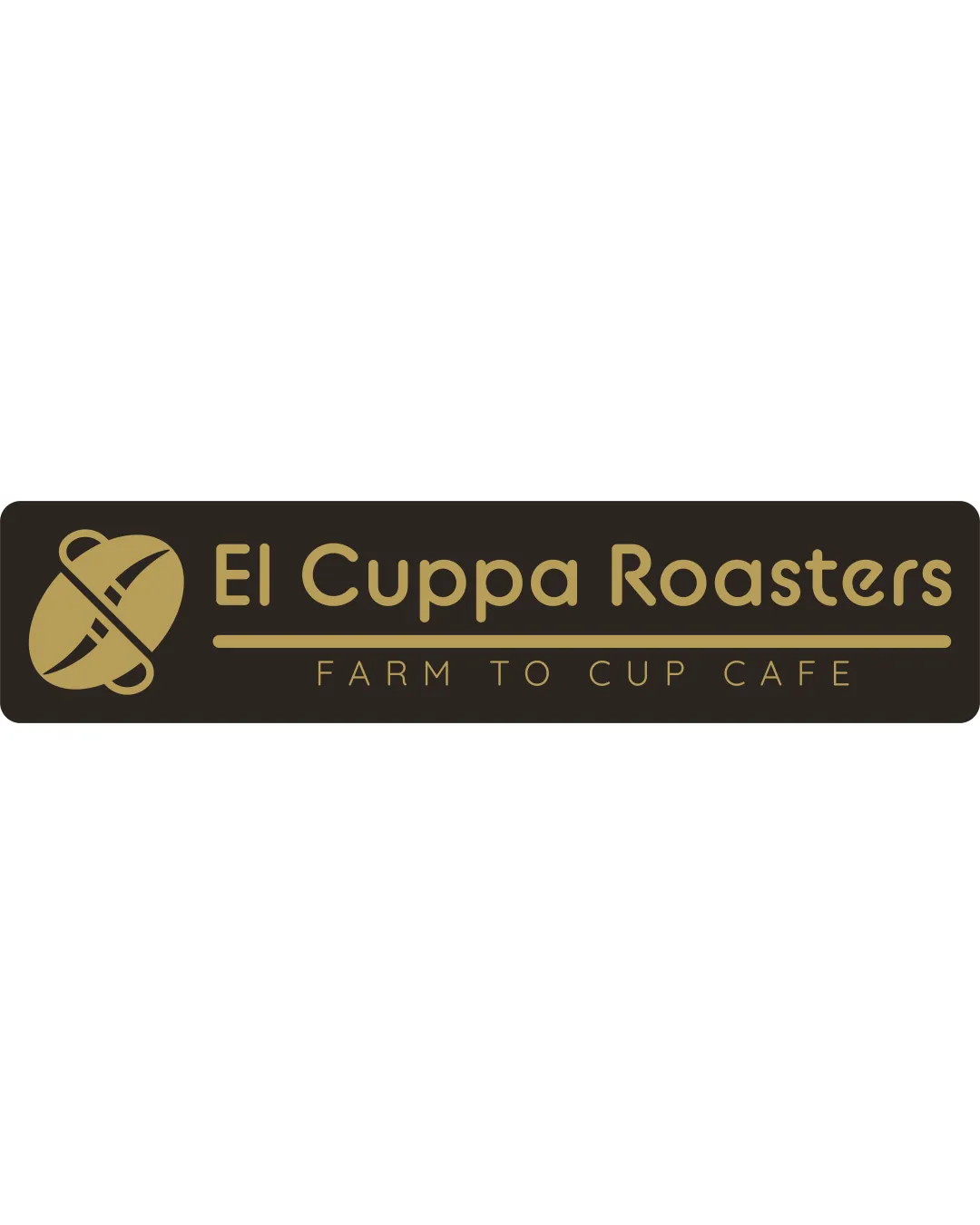
Try it Now!Logo review of El Cuppa Roasters
 Logo analysis by AI
Logo type:
Style:
Detected symbol:
Negative space:
Detected text:
Business industry:
Review requested by Grynpad
**If AI can recognize or misinterpret it, so can people.
Structured logo review
Legibility
![]() Text is clear and easy to read
Text is clear and easy to read![]() Fonts complement the coffee theme
Fonts complement the coffee theme
![]() Slightly more contrast could enhance readability
Slightly more contrast could enhance readability
Scalability versatility
![]() Simple lines ensure good scalability
Simple lines ensure good scalability
![]() Very small print might lose some detail on the symbol
Very small print might lose some detail on the symbol
200x250 px
100×125 px
50×62 px
Balance alignment
![]() Well-aligned elements
Well-aligned elements![]() Balanced use of space between text and symbol
Balanced use of space between text and symbol

Originality
![]() Creative use of coffee bean and cup elements
Creative use of coffee bean and cup elements
![]() Symbol is somewhat common in the coffee industry
Symbol is somewhat common in the coffee industry
Logomark wordmark fit
![]() Good integration of symbol and text
Good integration of symbol and text![]() Cohesive design
Cohesive design
![]() Symbol could be slightly more distinctive
Symbol could be slightly more distinctive
Aesthetic look
![]() Visually appealing and thematic design
Visually appealing and thematic design
![]() Could experiment with a bit more color
Could experiment with a bit more color
Dual meaning and misinterpretations
![]() No misinterpretations detected
No misinterpretations detected
Color harmony
![]() Minimalistic color palette works well for the theme
Minimalistic color palette works well for the theme
![]() Limited color use; might benefit from an additional accent color
Limited color use; might benefit from an additional accent color