Wondering how your logo performs? 🧐
Get professional logo reviews in seconds and catch design issues in time.
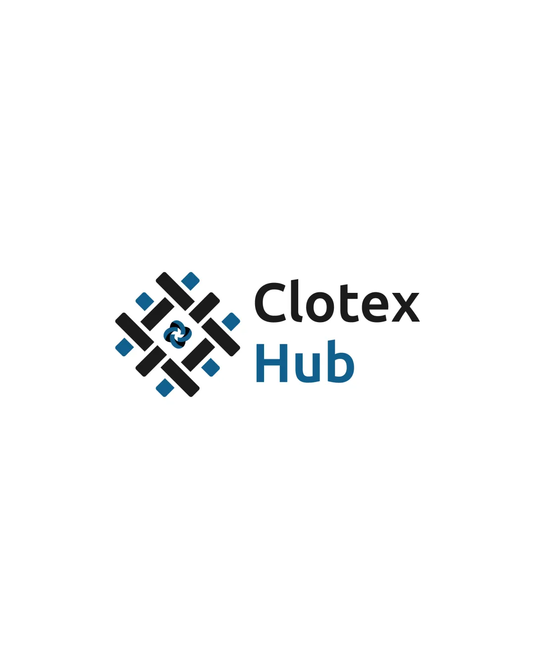
Try it Now!Logo review of Clotex Hub
 Logo analysis by AI
Logo type:
Style:
Detected symbol:
Negative space:
Detected text:
Business industry:
Review requested by Maksym
**If AI can recognize or misinterpret it, so can people.
Structured logo review
Legibility
![]() Text is clear and highly readable.
Text is clear and highly readable.![]() Font weight and spacing ensure visibility in both 'Clotex' and 'Hub'.
Font weight and spacing ensure visibility in both 'Clotex' and 'Hub'.
Scalability versatility
![]() Solid geometric construction supports reduction for web/app icons.
Solid geometric construction supports reduction for web/app icons.![]() Design works for print, signage, and packaging.
Design works for print, signage, and packaging.
![]() Fine lines and small central swirl detail may get lost in very small sizes, such as on tags or embroidery.
Fine lines and small central swirl detail may get lost in very small sizes, such as on tags or embroidery.
200x250 px
100×125 px
50×62 px
Balance alignment
![]() Logo mark and wordmark are generally well aligned vertically and horizontally.
Logo mark and wordmark are generally well aligned vertically and horizontally.![]() Good separation between mark and text prevents crowding.
Good separation between mark and text prevents crowding.
![]() Slight spacing imbalance between the logomark and the wordmark; the logo mark could be fractionally shifted upward for perfect visual balance.
Slight spacing imbalance between the logomark and the wordmark; the logo mark could be fractionally shifted upward for perfect visual balance.

Originality
![]() Woven textile motif suits the industry.
Woven textile motif suits the industry.![]() Central swirl gives some unique character.
Central swirl gives some unique character.
![]() Woven textile patterns are quite common in clothing and textile branding, making the mark feel somewhat generic.
Woven textile patterns are quite common in clothing and textile branding, making the mark feel somewhat generic.
Logomark wordmark fit
![]() Modern sans-serif pairs well with the geometric mark.
Modern sans-serif pairs well with the geometric mark.![]() Color palette is shared between elements for cohesion.
Color palette is shared between elements for cohesion.
![]() Font style is somewhat generic, reducing synergy with the symbol's distinctive quality.
Font style is somewhat generic, reducing synergy with the symbol's distinctive quality.
Aesthetic look
![]() Clean, uncluttered, professional appearance.
Clean, uncluttered, professional appearance.![]() Color palette is modern and visually appealing.
Color palette is modern and visually appealing.
![]() Design feels slightly cold/sterile for the fashion industry, which often calls for a more inviting or expressive look.
Design feels slightly cold/sterile for the fashion industry, which often calls for a more inviting or expressive look.
Dual meaning and misinterpretations
![]() No inappropriate or misleading secondary imagery detected.
No inappropriate or misleading secondary imagery detected.
Color harmony
![]() Excellent use of limited colors.
Excellent use of limited colors.![]() Good contrast between blue and black on white background enhances legibility.
Good contrast between blue and black on white background enhances legibility.
Black
#161616
Blue
#2780AC
White
#FFFFFF