Wondering how your logo performs? 🧐
Get professional logo reviews in seconds and catch design issues in time.
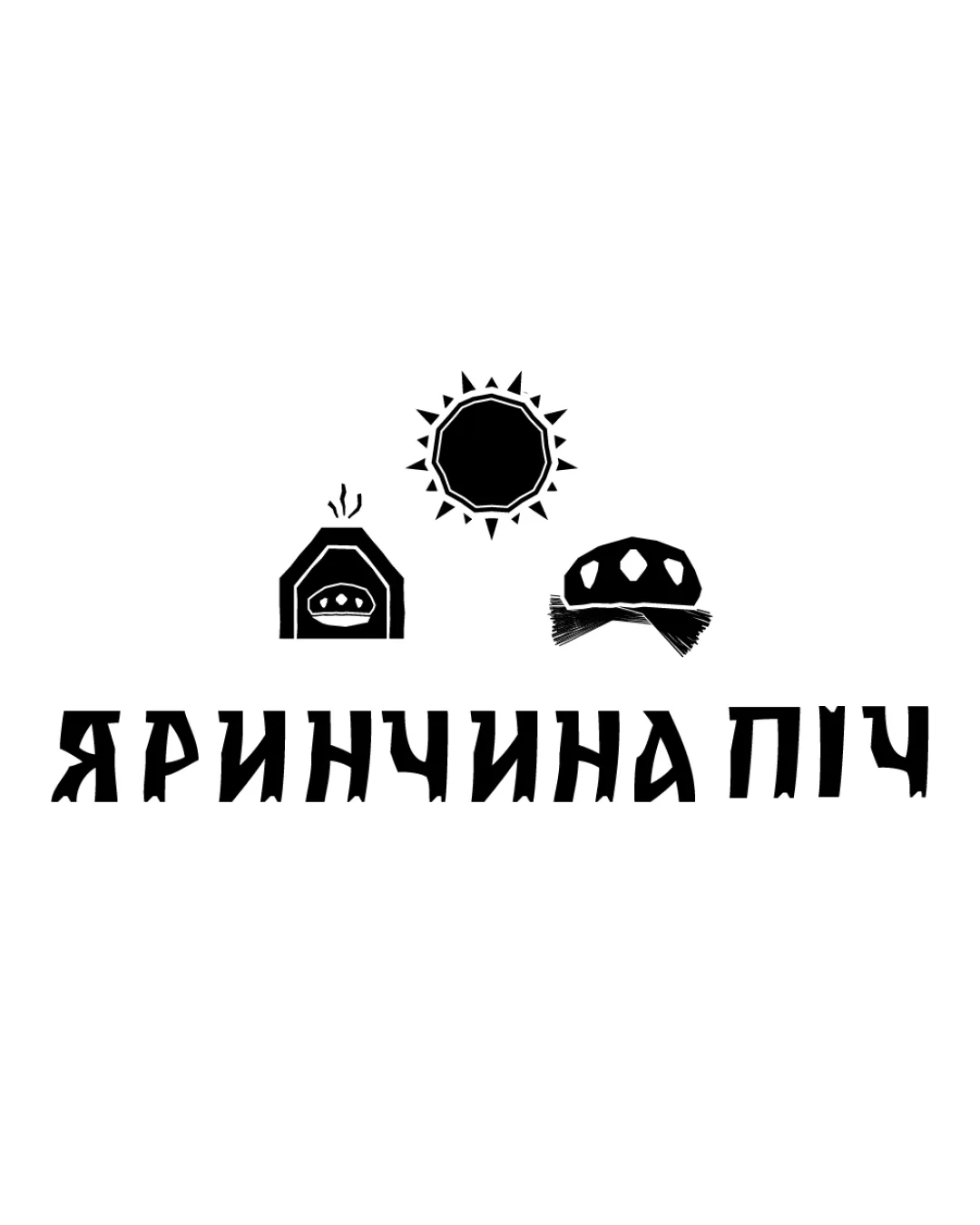
Try it Now!Logo review of Яринчина Піч

 Logo analysis by AI
Logo type:
Style:
Detected symbol:
Negative space:
Detected text:
Business industry:
Review requested by Yuliia
**If AI can recognize or misinterpret it, so can people.
Structured logo review
Legibility
![]() Text is mostly readable and harmoniously integrated with the illustration.
Text is mostly readable and harmoniously integrated with the illustration.![]() Font style is friendly and matches the artisanal theme.
Font style is friendly and matches the artisanal theme.
![]() Slightly condensed letters in the top word could be difficult to read at very small sizes.
Slightly condensed letters in the top word could be difficult to read at very small sizes.![]() The handwritten style may reduce readability for non-native readers or when used in very small formats.
The handwritten style may reduce readability for non-native readers or when used in very small formats.
Scalability versatility
![]() Works well on packaging, bakery signage, and menus.
Works well on packaging, bakery signage, and menus.![]() Bold shapes and limited color palette help clarity at medium sizes.
Bold shapes and limited color palette help clarity at medium sizes.
![]() Detailed hand illustration may lose clarity at very small sizes (e.g., business cards, enamel pins, favicon, embroidery).
Detailed hand illustration may lose clarity at very small sizes (e.g., business cards, enamel pins, favicon, embroidery).![]() Hand-drawn details and overlapping elements may not reproduce well in one-color or very small versions.
Hand-drawn details and overlapping elements may not reproduce well in one-color or very small versions.
200x250 px
100×125 px
50×62 px
Balance alignment
![]() Overall balanced between the illustration and text.
Overall balanced between the illustration and text.![]() Curved bread and hands complement the roundness of the text.
Curved bread and hands complement the roundness of the text.
![]() The lower part of the design (text and lower hand) can feel visually heavier than the top.
The lower part of the design (text and lower hand) can feel visually heavier than the top.![]() The negative space on the left of the logo (from the extreme 'Я') is a little more than on the right, leading to slight asymmetry.
The negative space on the left of the logo (from the extreme 'Я') is a little more than on the right, leading to slight asymmetry.

Originality
![]() Combining bread and hands gives a warm, original, welcoming message.
Combining bread and hands gives a warm, original, welcoming message.![]() Hand-drawn style adds distinctiveness.
Hand-drawn style adds distinctiveness.
![]() Bread + hands is a fairly common visual metaphor in bakery logos; lacks a groundbreaking twist.
Bread + hands is a fairly common visual metaphor in bakery logos; lacks a groundbreaking twist.![]() Does not utilize negative space for hidden meanings or dual symbolism.
Does not utilize negative space for hidden meanings or dual symbolism.
Logomark wordmark fit
![]() The illustration tightly integrates with the text, with both elements appearing cohesive in style and composition.
The illustration tightly integrates with the text, with both elements appearing cohesive in style and composition.
Aesthetic look
![]() Inviting, friendly, and expressive art style.
Inviting, friendly, and expressive art style.![]() Warm, appetizing color palette appropriate for the food industry.
Warm, appetizing color palette appropriate for the food industry.
![]() A bit busy; hands and bread shapes could be simplified to improve visual clarity.
A bit busy; hands and bread shapes could be simplified to improve visual clarity.![]() Whimsical style may not communicate premium quality if that is desired.
Whimsical style may not communicate premium quality if that is desired.
Dual meaning and misinterpretations
![]() Clear, family-friendly imagery with no unintended symbolism.
Clear, family-friendly imagery with no unintended symbolism.
Color harmony
![]() Warm brown and orange evoke wholesomeness and warmth.
Warm brown and orange evoke wholesomeness and warmth.![]() Simple palette avoids unnecessary distraction.
Simple palette avoids unnecessary distraction.![]() Good contrast between text and background.
Good contrast between text and background.
Brown
#A0521C
Orange
#FFA634
White
#FFFFFF