Wondering how your logo performs? 🧐
Get professional logo reviews in seconds and catch design issues in time.
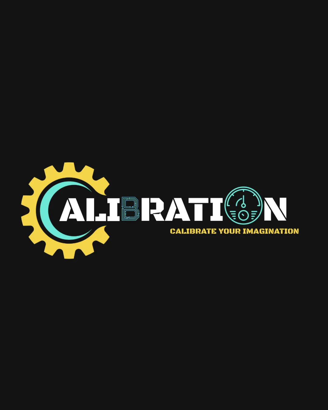
Try it Now!Logo review of CALIBRATION CALIBRATE YOUR IMAGINATION
 Logo analysis by AI
Logo type:
Style:
Detected symbol:
Detected text:
Business industry:
Review requested by Ferdoussur
**If AI can recognize or misinterpret it, so can people.
Structured logo review
Legibility
![]() Main text 'CALIBRATION' is largely readable with clear separation.
Main text 'CALIBRATION' is largely readable with clear separation.![]() Subtext 'CALIBRATE YOUR IMAGINATION' uses high-contrast yellow on black background.
Subtext 'CALIBRATE YOUR IMAGINATION' uses high-contrast yellow on black background.
![]() 'B' in 'CALIBRATION' uses a complex, outlined style that is harder to read and inconsistent with the rest of the word.
'B' in 'CALIBRATION' uses a complex, outlined style that is harder to read and inconsistent with the rest of the word.![]() Gauge symbol in 'O' increases complexity and hinders immediate reading.
Gauge symbol in 'O' increases complexity and hinders immediate reading.
Scalability versatility
![]() Strong iconography could stand out on medium to large signage (e.g., building signs, posters).
Strong iconography could stand out on medium to large signage (e.g., building signs, posters).
![]() Gear, swoosh, and gauge with detailed elements won't scale down well—details will be lost on business cards, mobile icons, or embroidery.
Gear, swoosh, and gauge with detailed elements won't scale down well—details will be lost on business cards, mobile icons, or embroidery.![]() 'B' loses readability at small sizes.
'B' loses readability at small sizes.![]() Subtext is thin and difficult to read at reduced scales.
Subtext is thin and difficult to read at reduced scales.
200x250 px
100×125 px
50×62 px
Balance alignment
![]() Gear and swoosh visually anchor the left side.
Gear and swoosh visually anchor the left side.
![]() Design feels crowded and heavy on both edges (gear on left, gauge on right), making the composition feel stretched.
Design feels crowded and heavy on both edges (gear on left, gauge on right), making the composition feel stretched.![]() Outlined 'B' disrupts the flow and weight of the wordmark.
Outlined 'B' disrupts the flow and weight of the wordmark.![]() Subtext alignment appears forced and not centered to the logo mark.
Subtext alignment appears forced and not centered to the logo mark.

Originality
![]() Unique combination of gear, gauge, and bold wordmark creates a recognizable identity.
Unique combination of gear, gauge, and bold wordmark creates a recognizable identity.![]() The attempt to highlight the 'B' and 'O' with special treatment is distinctive.
The attempt to highlight the 'B' and 'O' with special treatment is distinctive.
![]() Gear and gauge are very common in technology/engineering logos.
Gear and gauge are very common in technology/engineering logos.![]() Outlined B is not inventive enough to make the overall mark truly memorable.
Outlined B is not inventive enough to make the overall mark truly memorable.![]() Multiple generic symbols reduce impact of originality.
Multiple generic symbols reduce impact of originality.
Logomark wordmark fit
![]() Color palette links logomarks and wordmark.
Color palette links logomarks and wordmark.
![]() Style of the gauge/compass and gear does not harmonize with the solid, bold text style.
Style of the gauge/compass and gear does not harmonize with the solid, bold text style.![]() Outlined B disrupts cohesive appearance.
Outlined B disrupts cohesive appearance.
Aesthetic look
![]() Vibrant color palette.
Vibrant color palette.
![]() Jumbled with too many competing focal points (gear, swoosh, 'B', gauge).
Jumbled with too many competing focal points (gear, swoosh, 'B', gauge).![]() Distinct treatment on certain letters fragments the word visually.
Distinct treatment on certain letters fragments the word visually.![]() Overall busy rather than slick or minimal.
Overall busy rather than slick or minimal.
Dual meaning and misinterpretations
![]() No unintentional inappropriate or ambiguous symbols detected.
No unintentional inappropriate or ambiguous symbols detected.
Color harmony
![]() Limited to three principal colors and white, which avoids overwhelming the viewer.
Limited to three principal colors and white, which avoids overwhelming the viewer.
![]() Yellow subtext may have insufficient contrast on lighter backgrounds and could disappear.
Yellow subtext may have insufficient contrast on lighter backgrounds and could disappear.![]() Color distribution feels unbalanced with yellow gear isolated to one end.
Color distribution feels unbalanced with yellow gear isolated to one end.
Yellow
#FCDD62
Turquoise
#57E7E2
White
#FFFFFF
Black
#231F20