Wondering how your logo performs? 🧐
Get professional logo reviews in seconds and catch design issues in time.
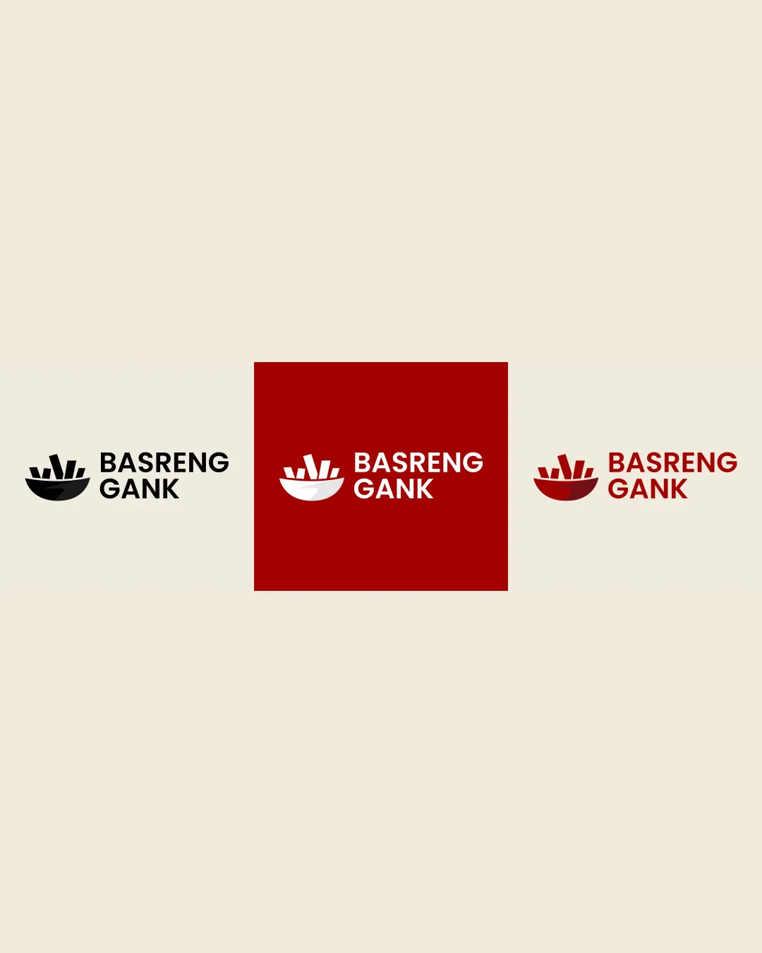
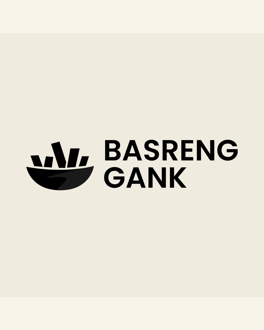
Try it Now!Logo review of BASRENG GANK
 Logo analysis by AI
Logo type:
Style:
Detected symbol:
Detected text:
Business industry:
Review requested by Ahmadirfan7828
**If AI can recognize or misinterpret it, so can people.
Structured logo review
Legibility
![]() Clear, bold sans-serif typeface ensures instant readability.
Clear, bold sans-serif typeface ensures instant readability.![]() Letter spacing is comfortable, no overlapping or confusion.
Letter spacing is comfortable, no overlapping or confusion.
Scalability versatility
![]() Simple shapes in the bowl and stick design will scale well to most applications.
Simple shapes in the bowl and stick design will scale well to most applications.![]() Logo is legible in small sizes and works on monochrome surfaces.
Logo is legible in small sizes and works on monochrome surfaces.![]() Suitable for packaging, signage, and app icons.
Suitable for packaging, signage, and app icons.
![]() Very thin gaps between snack sticks may blur at very small sizes, such as embroidery or tiny favicons.
Very thin gaps between snack sticks may blur at very small sizes, such as embroidery or tiny favicons.
200x250 px
100×125 px
50×62 px
Balance alignment
![]() Good proportional relationship between symbol and wordmark.
Good proportional relationship between symbol and wordmark.![]() Aligned horizontally for a clean and unified layout.
Aligned horizontally for a clean and unified layout.![]() Negative space is well managed; the symbol does not overpower the text.
Negative space is well managed; the symbol does not overpower the text.
![]() Slight visual imbalance due to the bowl's angle and placement beside a large blocky type. The visual weight of the symbol leans left, creating minor disharmony.
Slight visual imbalance due to the bowl's angle and placement beside a large blocky type. The visual weight of the symbol leans left, creating minor disharmony.

Originality
![]() Custom bowl and stick shapes offer slight differentiation.
Custom bowl and stick shapes offer slight differentiation.![]() Clear connection to food/snack industry.
Clear connection to food/snack industry.
![]() Bowl with sticks is a common motif for food/snack brands, offering little in terms of standout originality.
Bowl with sticks is a common motif for food/snack brands, offering little in terms of standout originality.![]() Symbol is somewhat generic when compared across food branding.
Symbol is somewhat generic when compared across food branding.
Logomark wordmark fit
![]() Both symbol and wordmark feature bold, geometric forms, creating visual cohesion.
Both symbol and wordmark feature bold, geometric forms, creating visual cohesion.![]() Black fills in both elements ensure a consistent style.
Black fills in both elements ensure a consistent style.
![]() The symbol feels more playful while the text is rigidly geometric, causing a small mismatch in brand expression.
The symbol feels more playful while the text is rigidly geometric, causing a small mismatch in brand expression.
Aesthetic look
![]() Minimal and functional aesthetic with a modern appeal.
Minimal and functional aesthetic with a modern appeal.![]() No unnecessary decoration or color overload.
No unnecessary decoration or color overload.
![]() Logo could be viewed as generic by some due to simplicity and familiar food iconography.
Logo could be viewed as generic by some due to simplicity and familiar food iconography.
Dual meaning and misinterpretations
![]() No offensive or inappropriate shapes present.
No offensive or inappropriate shapes present.![]() Imagery is direct and fits the food context.
Imagery is direct and fits the food context.
Color harmony
![]() Simple two-color scheme is harmonious and emphasizes clarity.
Simple two-color scheme is harmonious and emphasizes clarity.![]() High-contrast palette for visibility across formats.
High-contrast palette for visibility across formats.
Black
#191714
Beige
#F3EEDF