Wondering how your logo performs? 🧐
Get professional logo reviews in seconds and catch design issues in time.
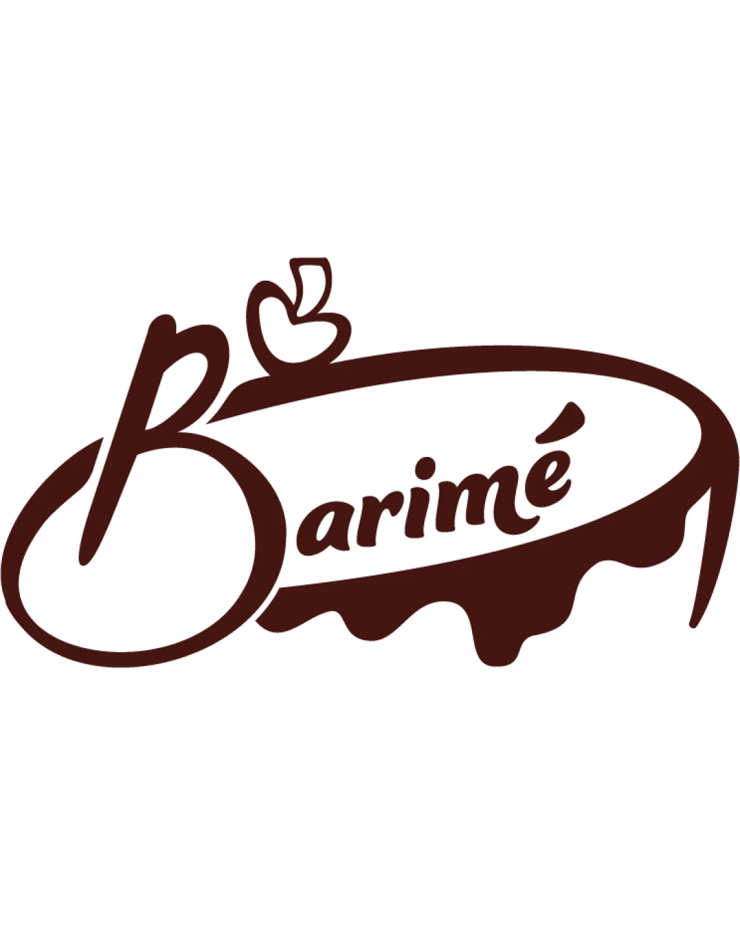
Try it Now!Logo review of Barimé
 Logo analysis by AI
Logo type:
Style:
Detected symbol:
Detected text:
Business industry:
Review requested by ELIONAZIO
**If AI can recognize or misinterpret it, so can people.
Structured logo review
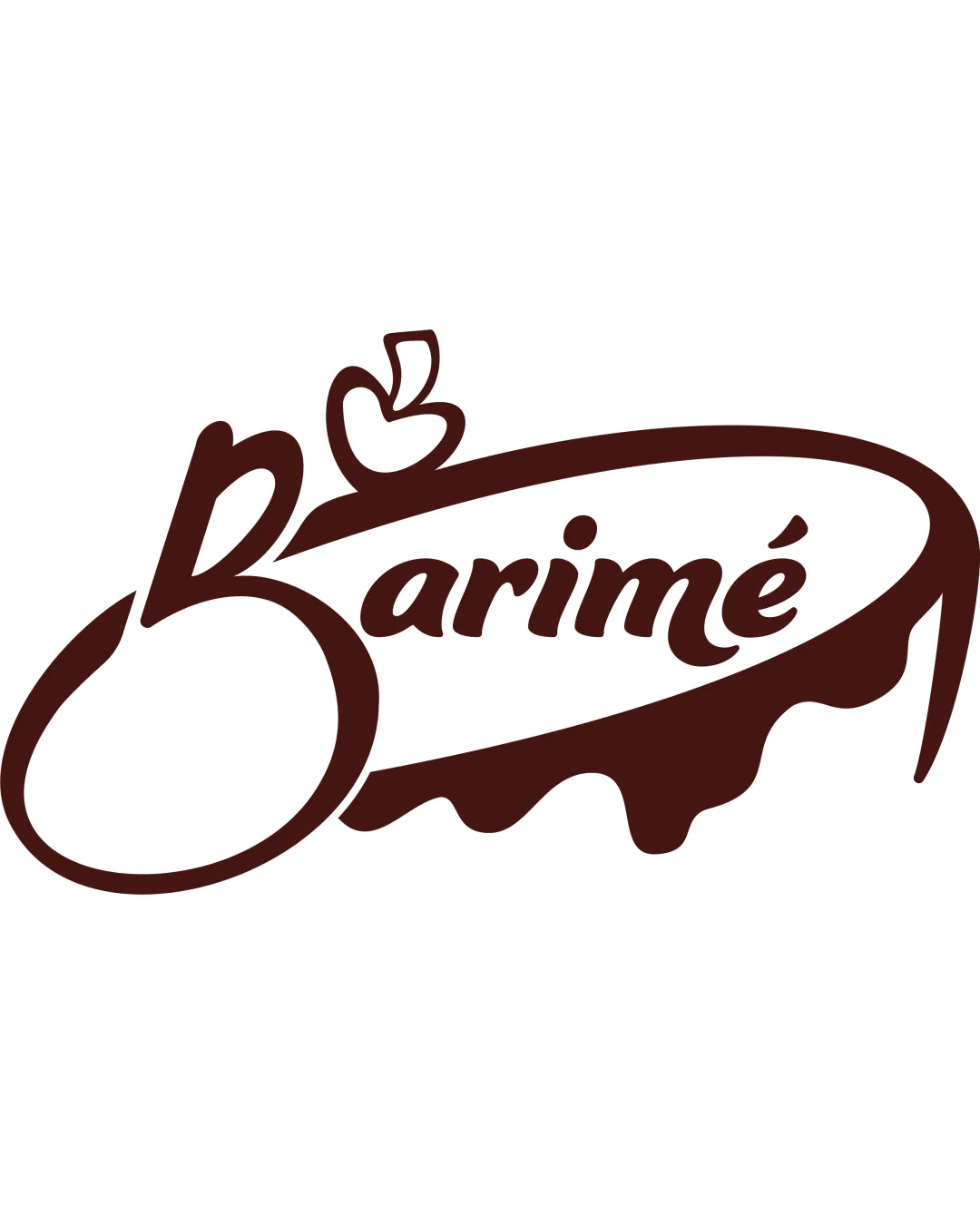
Legibility
![]() Middle and end of the wordmark are generally easy to read.
Middle and end of the wordmark are generally easy to read.![]() Script style gives a friendly, handmade feeling aligning with food/bakery vibes.
Script style gives a friendly, handmade feeling aligning with food/bakery vibes.
![]() The highly stylized 'B' is difficult to recognize at first glance and may look like an abstract shape to some viewers.
The highly stylized 'B' is difficult to recognize at first glance and may look like an abstract shape to some viewers.![]() The apple symbol overlapping the letter adds visual confusion to the beginning of the wordmark.
The apple symbol overlapping the letter adds visual confusion to the beginning of the wordmark.![]() The accent on 'é' is small and could get lost at small sizes.
The accent on 'é' is small and could get lost at small sizes.
Scalability versatility
![]() Single-color execution performs well on some packaging, labels, or monochrome prints.
Single-color execution performs well on some packaging, labels, or monochrome prints.![]() Overall bold shape can stand out on larger surfaces.
Overall bold shape can stand out on larger surfaces.
![]() Fine details in the apple and swoosh get lost when scaled down for favicons, small labels, or embroidery.
Fine details in the apple and swoosh get lost when scaled down for favicons, small labels, or embroidery.![]() Thick-and-thin script lines may not translate cleanly on embroidered uniforms or very small applications.
Thick-and-thin script lines may not translate cleanly on embroidered uniforms or very small applications.![]() Complexity and overlapping elements could clog or blur at small sizes.
Complexity and overlapping elements could clog or blur at small sizes.
200x250 px
100×125 px
50×62 px
Balance alignment
![]() Curved swoosh encapsulates the wordmark nicely and gives a sense of enclosure.
Curved swoosh encapsulates the wordmark nicely and gives a sense of enclosure.
![]() The large, stylized 'B' is disproportionately heavy compared to the rest of the word and pulls visual weight to the left.
The large, stylized 'B' is disproportionately heavy compared to the rest of the word and pulls visual weight to the left.![]() Apple symbol feels detached and disrupts the flow from left to right.
Apple symbol feels detached and disrupts the flow from left to right.![]() The swoosh underneath feels much heavier on one side, making overall balance awkward.
The swoosh underneath feels much heavier on one side, making overall balance awkward.

Originality
![]() Incorporation of apple and icing motif into the wordmark shows creativity and industry relevance.
Incorporation of apple and icing motif into the wordmark shows creativity and industry relevance.![]() Hand-drawn script style feels unique compared to generic sans-serifs.
Hand-drawn script style feels unique compared to generic sans-serifs.
![]() The apple symbol itself is a common food logo motif, somewhat reducing novelty.
The apple symbol itself is a common food logo motif, somewhat reducing novelty.![]() Swoosh/icing underlining is an often-used bakery/food logo trope.
Swoosh/icing underlining is an often-used bakery/food logo trope.
Logomark wordmark fit
![]() The apple motif conceptually ties into the script and product category.
The apple motif conceptually ties into the script and product category.
![]() Apple symbol's boldness and placement clash slightly with the flow of the script.
Apple symbol's boldness and placement clash slightly with the flow of the script.![]() The element feels inserted rather than fully integrated into the letterform.
The element feels inserted rather than fully integrated into the letterform.
Aesthetic look
![]() Visually lively and friendly personal touch.
Visually lively and friendly personal touch.
![]() Swoosh and apple introduce visual clutter near the start of the logotype.
Swoosh and apple introduce visual clutter near the start of the logotype.![]() Unbalanced left/right weight and complex shapes reduce elegance.
Unbalanced left/right weight and complex shapes reduce elegance.
Dual meaning and misinterpretations
![]() No obvious inappropriate double meanings or poor symbolism detected.
No obvious inappropriate double meanings or poor symbolism detected.
Color harmony
![]() Simple, restrained one-color palette; easy to reproduce across media.
Simple, restrained one-color palette; easy to reproduce across media.![]() Good contrast with white background.
Good contrast with white background.
DarkBrown
#4B2920
White
#FFFFFF