Wondering how your logo performs? 🧐
Get professional logo reviews in seconds and catch design issues in time.
Try it Now!Logo review of TINA nails studio
 Logo analysis by AI
Logo type:
Style:
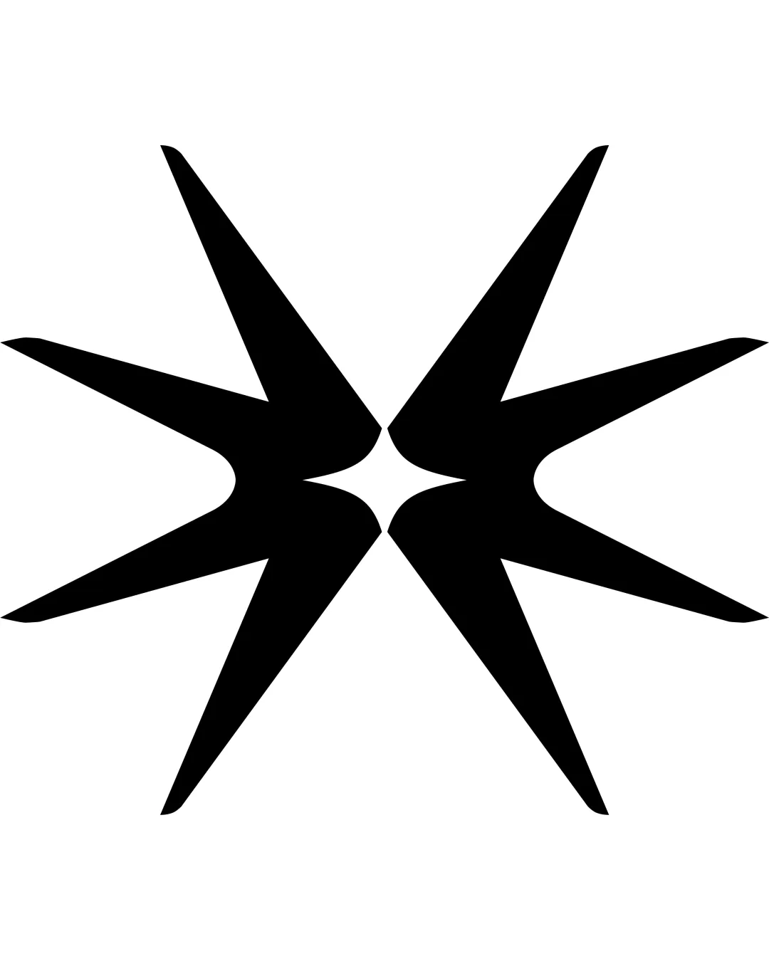
Detected symbol:
Negative space:
Detected text:
Business industry:
Review requested by SophieOlexiv
**If AI can recognize or misinterpret it, so can people.
Structured logo review
Legibility
![]() Text is clear and easy to read.
Text is clear and easy to read.![]() Font weight provides strong visibility at various sizes.
Font weight provides strong visibility at various sizes.
Scalability versatility
![]() Bold typography remains recognizable at medium and large scales.
Bold typography remains recognizable at medium and large scales.![]() Solid color improves print versatility.
Solid color improves print versatility.
![]() Fine details inside the 'A' (nail and star) may lose clarity at very small scales such as favicons or embroidery.
Fine details inside the 'A' (nail and star) may lose clarity at very small scales such as favicons or embroidery.![]() Stacked text layout may be challenging to adapt for vertical signage or narrow formats.
Stacked text layout may be challenging to adapt for vertical signage or narrow formats.
200x250 px
100×125 px
50×62 px
Balance alignment
![]() Well-centered and balanced between the two lines of text.
Well-centered and balanced between the two lines of text.![]() The embedded symbol in 'A' is visually anchored.
The embedded symbol in 'A' is visually anchored.
![]() The heightened visual weight of the altered 'A' makes the right side slightly heavier than the left, causing minor imbalance.
The heightened visual weight of the altered 'A' makes the right side slightly heavier than the left, causing minor imbalance.

Originality
![]() Clever use of negative space in the 'A' to emphasize the nail and star theme.
Clever use of negative space in the 'A' to emphasize the nail and star theme.![]() Distinctive and industry-appropriate customization.
Distinctive and industry-appropriate customization.
![]() General wordmark approach is common; stronger distinction could be achieved with a standalone symbol for use in social icons or merch.
General wordmark approach is common; stronger distinction could be achieved with a standalone symbol for use in social icons or merch.
Logomark wordmark fit
![]() The stylized 'A' integrates seamlessly with the rest of the wordmark.
The stylized 'A' integrates seamlessly with the rest of the wordmark.![]() Brand theme is communicated directly within the text.
Brand theme is communicated directly within the text.
Aesthetic look
![]() Bright color palette is eye-catching and fitting for the beauty industry.
Bright color palette is eye-catching and fitting for the beauty industry.![]() Typography style is bold yet stylish, conveying energy.
Typography style is bold yet stylish, conveying energy.
![]() Custom element in the 'A' may feel slightly forced and draws attention away from the overall wordmark coherence.
Custom element in the 'A' may feel slightly forced and draws attention away from the overall wordmark coherence.
Dual meaning and misinterpretations
![]() Star and nail graphic are straightforward and appropriate.
Star and nail graphic are straightforward and appropriate.
Color harmony
![]() Two-color palette is harmonious, lively, and maintains high contrast.
Two-color palette is harmonious, lively, and maintains high contrast.![]() Color combo supports legibility and industry appeal.
Color combo supports legibility and industry appeal.
DeepPink
#FF1493
Snow
#F9EEF6