Wondering how your logo performs? 🧐
Get professional logo reviews in seconds and catch design issues in time.
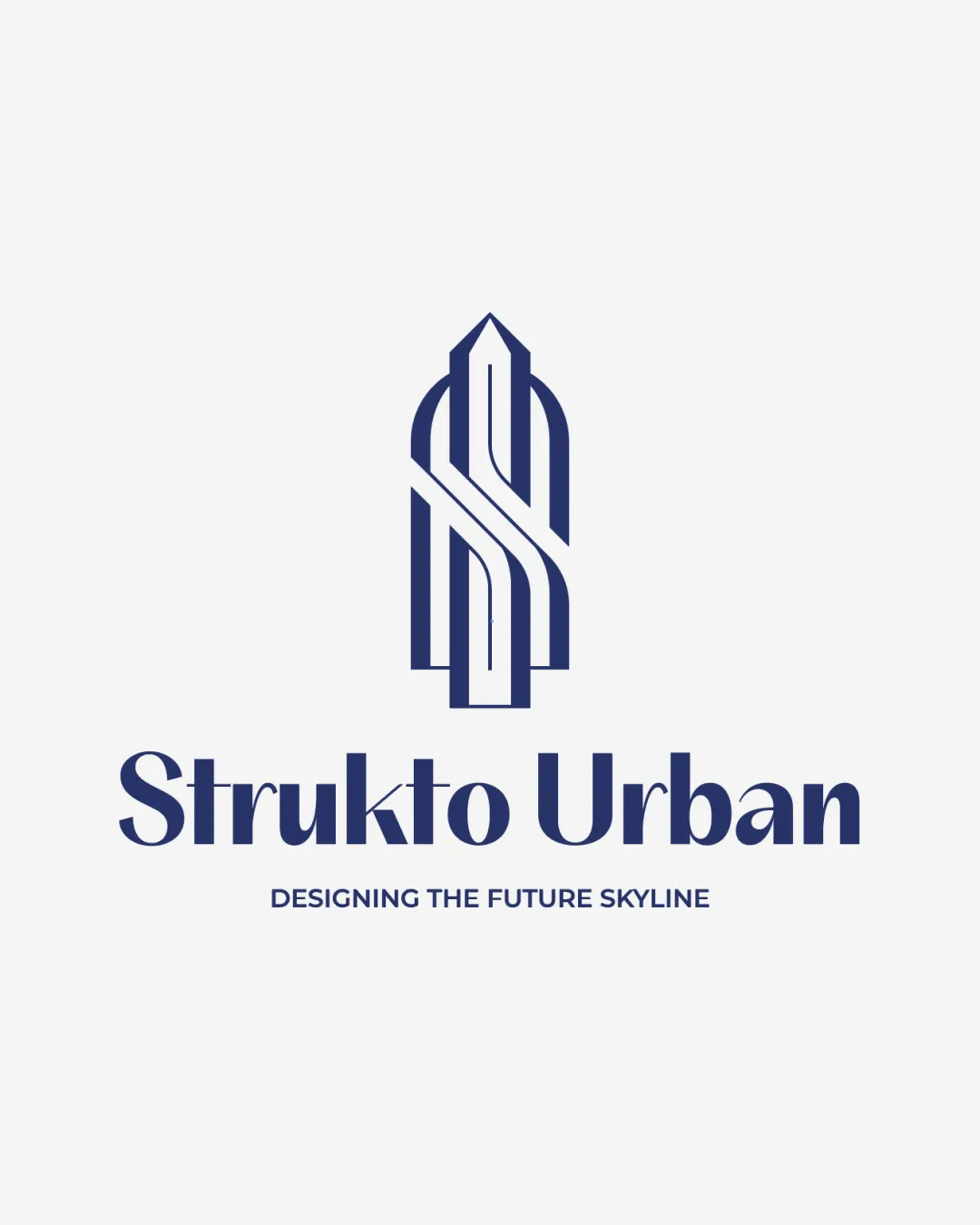
Try it Now!Logo review of Strukto Urban, DESIGNING THE FUTURE SKYLINE
 Logo analysis by AI
Logo type:
Style:
Detected symbol:
Negative space:
Detected text:
Business industry:
Review requested by Graphstorm
**If AI can recognize or misinterpret it, so can people.
Structured logo review
Legibility
![]() Primary name 'Strukto Urban' is bold, contrasted, and readable.
Primary name 'Strukto Urban' is bold, contrasted, and readable.![]() The tagline is legible but smaller, still clear against the light background.
The tagline is legible but smaller, still clear against the light background.
![]() The stylized K in 'Strukto' may cause slight hesitation when reading as it breaks the letterform.
The stylized K in 'Strukto' may cause slight hesitation when reading as it breaks the letterform.![]() The tagline may be hard to read at very small sizes.
The tagline may be hard to read at very small sizes.
Scalability versatility
![]() The monogram is contained and reasonably simple, lending itself to many applications like signage and web use.
The monogram is contained and reasonably simple, lending itself to many applications like signage and web use.![]() Strong color contrast preserves visibility on both print and digital.
Strong color contrast preserves visibility on both print and digital.
![]() Thin inner lines of the monogram may lose clarity at small scales (e.g. business cards, embroidery, favicons).
Thin inner lines of the monogram may lose clarity at small scales (e.g. business cards, embroidery, favicons).![]() Tagline is too small to be useful on small-scale applications.
Tagline is too small to be useful on small-scale applications.
200x250 px
100×125 px
50×62 px
Balance alignment
![]() Logo symbol is centered above the logotype for a well-anchored visual stack.
Logo symbol is centered above the logotype for a well-anchored visual stack.![]() Good proportional relationship between symbol and wordmark.
Good proportional relationship between symbol and wordmark.
![]() The boldness contrast between the thinner monogram and heavier type creates a slight imbalance, especially in small-size mockups.
The boldness contrast between the thinner monogram and heavier type creates a slight imbalance, especially in small-size mockups.

Originality
![]() Monogram cleverly fuses initials with a structure, providing visual relevance to the brand's field.
Monogram cleverly fuses initials with a structure, providing visual relevance to the brand's field.![]() Arrow and building forms add dual meaning unique to the industry.
Arrow and building forms add dual meaning unique to the industry.
![]() The concept of combining initials into a building silhouette is not completely novel in real estate and architecture sectors.
The concept of combining initials into a building silhouette is not completely novel in real estate and architecture sectors.![]() Could risk blending into common industry tropes if not further differentiated.
Could risk blending into common industry tropes if not further differentiated.
Logomark wordmark fit
![]() The geometric, contemporary style of both mark and wordmark create a cohesive brand system.
The geometric, contemporary style of both mark and wordmark create a cohesive brand system.![]() Both elements share a strong line weight and color consistency.
Both elements share a strong line weight and color consistency.
Aesthetic look
![]() Minimalist, clean composition communicates professionalism and modernity.
Minimalist, clean composition communicates professionalism and modernity.![]() Aesthetic use of negative space with the arrow.
Aesthetic use of negative space with the arrow.
![]() Monogram may appear too stiff or corporate, limiting emotional warmth.
Monogram may appear too stiff or corporate, limiting emotional warmth.![]() Tagline feels visually detached due to smaller size.
Tagline feels visually detached due to smaller size.
Dual meaning and misinterpretations
![]() Arrow and building motif reinforce positive progress and growth ideas.
Arrow and building motif reinforce positive progress and growth ideas.![]() Monogram interpretation is clear and professional.
Monogram interpretation is clear and professional.
Color harmony
![]() Monochrome palette gives strong, professional look.
Monochrome palette gives strong, professional look.![]() High contrast between navy and white ensures strong visibility.
High contrast between navy and white ensures strong visibility.
Dark Blue
#24316D
White
#F7F7F7