Wondering how your logo performs? 🧐
Get professional logo reviews in seconds and catch design issues in time.
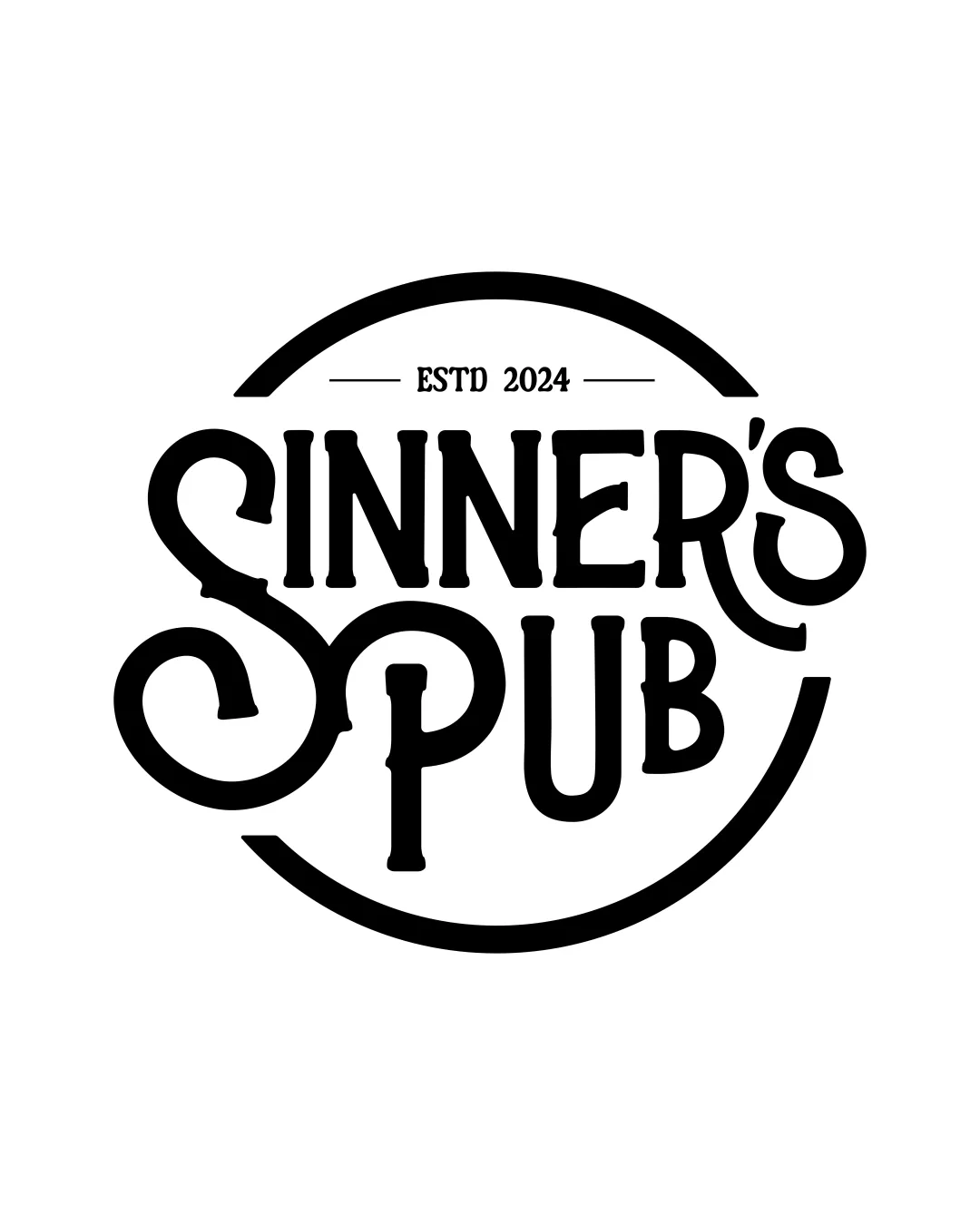
Try it Now!Logo review of SINNER'S PUB
 Logo analysis by AI
Logo type:
Style:
Detected symbol:
Detected text:
Business industry:
Review requested by Gama
**If AI can recognize or misinterpret it, so can people.
Structured logo review
Legibility
![]() Text is generally clear and large
Text is generally clear and large
![]() Decorative elements might slightly hinder readability in small sizes
Decorative elements might slightly hinder readability in small sizes
Scalability versatility
![]() Bold lines ensure good visibility for large applications like signage
Bold lines ensure good visibility for large applications like signage
![]() Complexity may reduce clarity in very small sizes
Complexity may reduce clarity in very small sizes
200x250 px
100×125 px
50×62 px
Balance alignment
![]() Visually balanced with circular frame
Visually balanced with circular frame
![]() Minor alignment issues in text spacing
Minor alignment issues in text spacing

Originality
![]() Unique vintage style reflects industry vibe
Unique vintage style reflects industry vibe
![]() Circular text arrangement is relatively common
Circular text arrangement is relatively common
Aesthetic look
![]() Visually striking with a cohesive vintage style
Visually striking with a cohesive vintage style
Dual meaning and misinterpretations
![]() No inappropriate symbols observed
No inappropriate symbols observed
Color harmony
![]() Simple black and white scheme ensures high contrast and focus
Simple black and white scheme ensures high contrast and focus
Black
#000000
White
#FFFFFF