Wondering how your logo performs? 🧐
Get professional logo reviews in seconds and catch design issues in time.
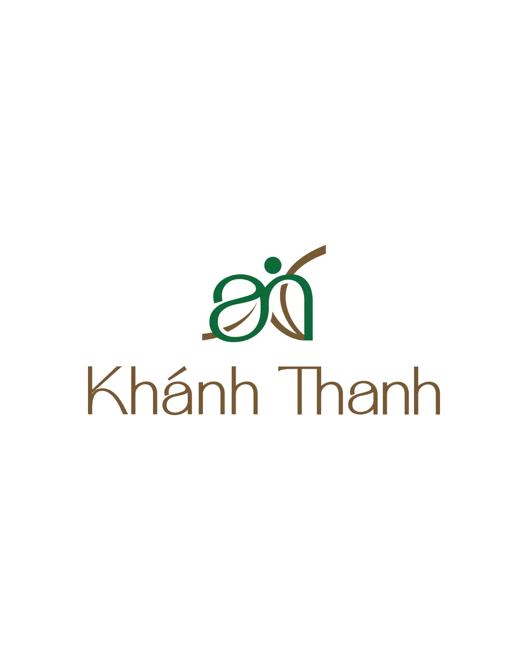
Try it Now!Logo review of Khánh Thanh
 Logo analysis by AI
Logo type:
Style:
Detected symbol:
Detected text:
Business industry:
Review requested by Brandee
**If AI can recognize or misinterpret it, so can people.
Structured logo review
Legibility
![]() Clear and readable text
Clear and readable text![]() Consistent font style
Consistent font style
Scalability versatility
![]() Simple design suitable for various sizes
Simple design suitable for various sizes![]() Works well for business cards and signage
Works well for business cards and signage
![]() Thin lines may be challenging in very small formats
Thin lines may be challenging in very small formats
200x250 px
100×125 px
50×62 px
Balance alignment
![]() Balanced proportions between symbol and text
Balanced proportions between symbol and text![]() Well-aligned elements
Well-aligned elements
![]() Slightly larger symbol could improve balance
Slightly larger symbol could improve balance

Originality
![]() Unique combination of abstract person and leaf shapes
Unique combination of abstract person and leaf shapes
![]() Could be more distinctive to stand out in the industry
Could be more distinctive to stand out in the industry
Logomark wordmark fit
![]() Cohesive style between logomark and wordmark
Cohesive style between logomark and wordmark![]() Consistent color scheme
Consistent color scheme
Aesthetic look
![]() Elegant and clean design
Elegant and clean design![]() Modern aesthetic
Modern aesthetic
![]() Could explore more dynamic shapes
Could explore more dynamic shapes
Dual meaning and misinterpretations
![]() No inappropriate symbols detected
No inappropriate symbols detected
Color harmony
![]() Well-chosen color palette
Well-chosen color palette![]() Good contrast between green and brown shades
Good contrast between green and brown shades