Wondering how your logo performs? 🧐
Get professional logo reviews in seconds and catch design issues in time.
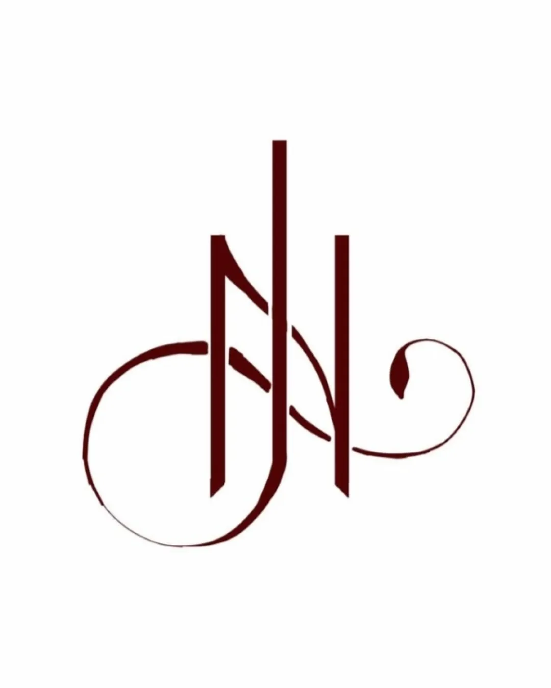
Try it Now!Logo review of J N
 Logo analysis by AI
Logo type:
Style:
Detected symbol:
Detected text:
Business industry:
Review requested by Nixie
**If AI can recognize or misinterpret it, so can people.
Structured logo review
Legibility
![]() The vertical strokes are clean and uniform in color.
The vertical strokes are clean and uniform in color.
![]() Ornate flourishes diminish clarity, making the letters difficult to parse at first glance, especially for those unfamiliar with the brand.
Ornate flourishes diminish clarity, making the letters difficult to parse at first glance, especially for those unfamiliar with the brand.![]() The overlapping of letterforms further reduces instant readability.
The overlapping of letterforms further reduces instant readability.![]() The decorative style may hinder recognition at smaller sizes.
The decorative style may hinder recognition at smaller sizes.
Scalability versatility
![]() Will work well on large-scale applications like signage or invitations.
Will work well on large-scale applications like signage or invitations.
![]() Swashes and thin flourishes will likely be lost or blurred in small-scale uses such as business cards or social media avatars.
Swashes and thin flourishes will likely be lost or blurred in small-scale uses such as business cards or social media avatars.![]() Design complexity impairs reproduction on embroidery or stamps.
Design complexity impairs reproduction on embroidery or stamps.![]() Logo loses its calligraphic elegance and legibility at reduced scales.
Logo loses its calligraphic elegance and legibility at reduced scales.
200x250 px
100×125 px
50×62 px
Balance alignment
![]() Central vertical axis creates a sense of structure; symmetrical appearance overall.
Central vertical axis creates a sense of structure; symmetrical appearance overall.
![]() Heavy vertical strokes contrast sharply with light flourishes, leading to visual imbalance.
Heavy vertical strokes contrast sharply with light flourishes, leading to visual imbalance.![]() Ornamental swashes on left and right are uneven in weight and size.
Ornamental swashes on left and right are uneven in weight and size.![]() Lower part feels visually heavier due to extended left stroke.
Lower part feels visually heavier due to extended left stroke.

Originality
![]() Distinctive calligraphic style adds uniqueness.
Distinctive calligraphic style adds uniqueness.![]() Creative integration of initials is eye-catching and elegant.
Creative integration of initials is eye-catching and elegant.
![]() Monogram concepts are not uncommon in the hospitality or luxury market, diminishing overall novelty.
Monogram concepts are not uncommon in the hospitality or luxury market, diminishing overall novelty.![]() Does not leverage negative space in a compelling or innovative way.
Does not leverage negative space in a compelling or innovative way.
Aesthetic look
![]() Sophisticated and elegant appearance with a luxury vibe.
Sophisticated and elegant appearance with a luxury vibe.![]() Consistent color choice boosts visual cohesion.
Consistent color choice boosts visual cohesion.
![]() Visually busy due to overlapping and elaborate flourishes.
Visually busy due to overlapping and elaborate flourishes.![]() Aesthetic appeal is subjective and might not suit all tastes or modern branding trends.
Aesthetic appeal is subjective and might not suit all tastes or modern branding trends.
Dual meaning and misinterpretations
![]() No immediately apparent inappropriate imagery.
No immediately apparent inappropriate imagery.![]() The letter design stays clear of accidental negative connotations.
The letter design stays clear of accidental negative connotations.
Color harmony
![]() Simple two-color palette maintains elegance and ties well with luxury brands.
Simple two-color palette maintains elegance and ties well with luxury brands.![]() Excellent contrast between logo and white background.
Excellent contrast between logo and white background.
Deep Burgundy
#531009
White
#FFFFFF