Wondering how your logo performs? 🧐
Get professional logo reviews in seconds and catch design issues in time.
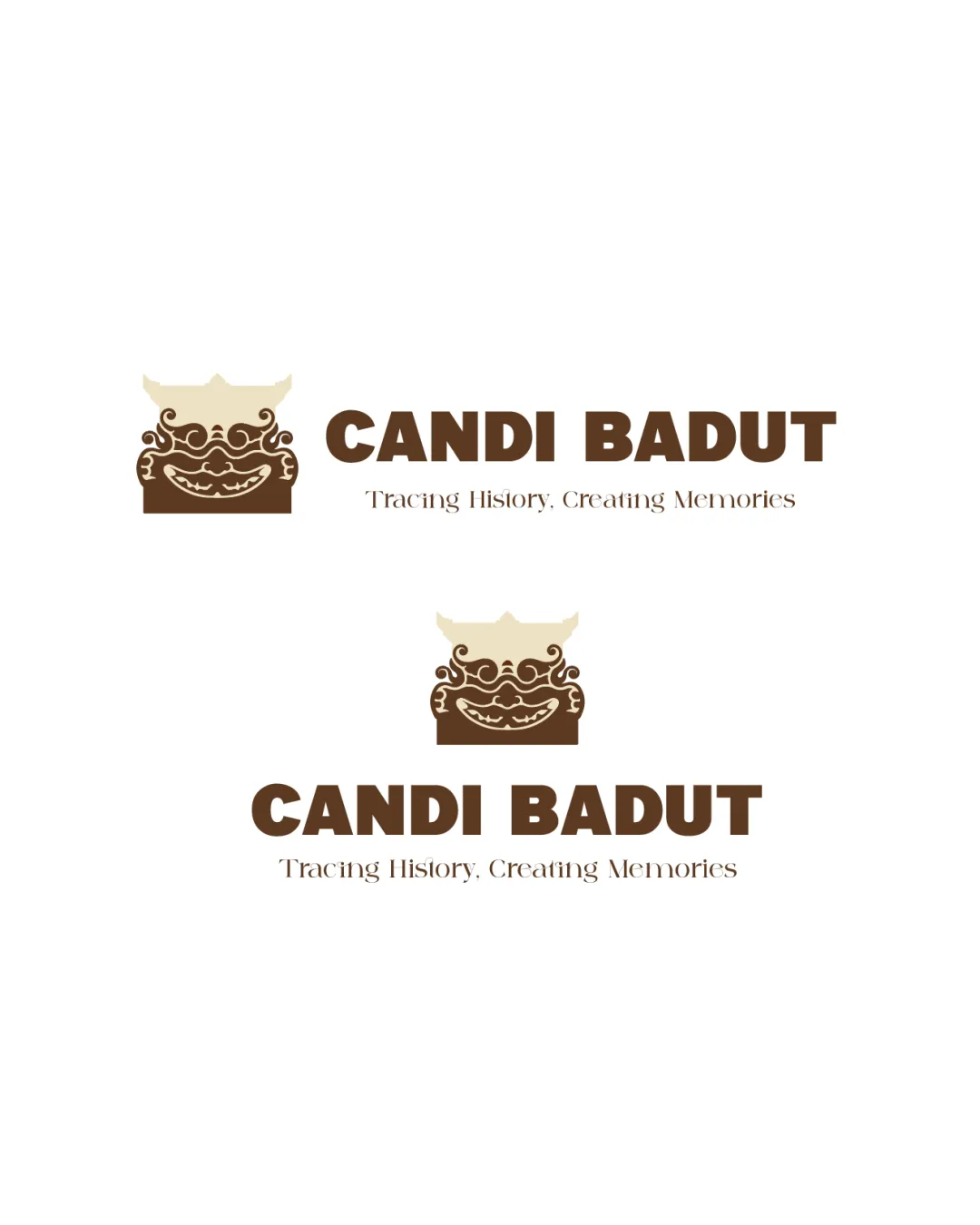
Try it Now!Logo review of CANDI BADUT, Tracing History, Creating Memories
 Logo analysis by AI
Logo type:
Style:
Detected symbol:
Detected text:
Business industry:
Review requested by Axztraa
**If AI can recognize or misinterpret it, so can people.
Structured logo review
Legibility
![]() Primary name 'CANDI BADUT' is bold and clear, making it easily readable at various sizes.
Primary name 'CANDI BADUT' is bold and clear, making it easily readable at various sizes.![]() Distinct contrast between text and background for main headline.
Distinct contrast between text and background for main headline.
![]() Tagline ‘Tracing History, Creating Memories’ uses a thin, decorative serif which may lose legibility at very small sizes or from a distance.
Tagline ‘Tracing History, Creating Memories’ uses a thin, decorative serif which may lose legibility at very small sizes or from a distance.![]() Tagline color could benefit from increased contrast for accessibility.
Tagline color could benefit from increased contrast for accessibility.
Scalability versatility
![]() Bold wordmark is effective for both large and small applications.
Bold wordmark is effective for both large and small applications.![]() Simplified color palette enhances versatility.
Simplified color palette enhances versatility.
![]() Intricate details in the mask/relief symbol may become muddled or lost in smaller applications such as favicons, business cards, or embroidery.
Intricate details in the mask/relief symbol may become muddled or lost in smaller applications such as favicons, business cards, or embroidery.![]() Tagline will not be legible in compact formats.
Tagline will not be legible in compact formats.
200x250 px
100×125 px
50×62 px
Balance alignment
![]() Logomark and wordmark are aligned horizontally, providing a cohesive structure.
Logomark and wordmark are aligned horizontally, providing a cohesive structure.![]() Vertical stacked version is balanced around the central axis.
Vertical stacked version is balanced around the central axis.
![]() Ornamental symbol has visual complexity compared to bold letterforms, which creates a slight imbalance between text weight and graphical unit.
Ornamental symbol has visual complexity compared to bold letterforms, which creates a slight imbalance between text weight and graphical unit.

Originality
![]() Unique representation of local historical symbolism provides cultural distinctiveness.
Unique representation of local historical symbolism provides cultural distinctiveness.![]() Custom illustration stands apart from generic tourism/heritage logos.
Custom illustration stands apart from generic tourism/heritage logos.
![]() Ornamented mask motif could be perceived as similar to other temple or heritage iconography, which may slightly impact originality.
Ornamented mask motif could be perceived as similar to other temple or heritage iconography, which may slightly impact originality.
Logomark wordmark fit
![]() Color palette is consistent between logomark and wordmark.
Color palette is consistent between logomark and wordmark.![]() Historical tone is echoed in both the illustration and font choices.
Historical tone is echoed in both the illustration and font choices.
![]() Contrasting styles—bold blocky wordmark with an ornate, detailed symbol—could benefit from a more harmonious interplay.
Contrasting styles—bold blocky wordmark with an ornate, detailed symbol—could benefit from a more harmonious interplay.
Aesthetic look
![]() Logo feels intentional and visually engaging, reflecting the theme well.
Logo feels intentional and visually engaging, reflecting the theme well.![]() Color choices add a timeless, earthy feel.
Color choices add a timeless, earthy feel.
![]() Slightly busy due to minute decorative details, which could be simplified for greater impact.
Slightly busy due to minute decorative details, which could be simplified for greater impact.
Dual meaning and misinterpretations
![]() Symbolism is culturally and historically appropriate.
Symbolism is culturally and historically appropriate.![]() No inappropriate or unforeseen visual interpretations detected.
No inappropriate or unforeseen visual interpretations detected.
Color harmony
![]() Muted, earthy tones are well matched and suitable for the historical theme.
Muted, earthy tones are well matched and suitable for the historical theme.![]() Color scheme is limited, cohesive, and professional.
Color scheme is limited, cohesive, and professional.
Beige
#F4E3C3
Dark Brown
#5A3924
White
#FFFFFF