Wondering how your logo performs? 🧐
Get professional logo reviews in seconds and catch design issues in time.
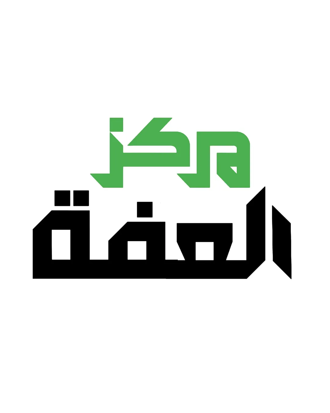
Try it Now!Logo review of مركز الثقة
 Logo analysis by AI
Logo type:
Style:
Detected text:
Business industry:
Review requested by Fx6
**If AI can recognize or misinterpret it, so can people.
Structured logo review
Legibility
![]() Strong visual separation between the green and black text lines.
Strong visual separation between the green and black text lines.![]() Clear geometric letterforms that amplify typographic structure.
Clear geometric letterforms that amplify typographic structure.
![]() The sharp angular style slightly reduces instant readability, especially for audiences unfamiliar with geometric Kufic fonts.
The sharp angular style slightly reduces instant readability, especially for audiences unfamiliar with geometric Kufic fonts.
Scalability versatility
![]() Bold shapes and solid fills ensure the logo remains legible when scaled down for digital use or small print.
Bold shapes and solid fills ensure the logo remains legible when scaled down for digital use or small print.![]() Monochrome adaptation would work well for most applications, including signage and stamps.
Monochrome adaptation would work well for most applications, including signage and stamps.
![]() The intricate geometry, especially in small text sizes, may cause some loss of letter definition, primarily in the green section.
The intricate geometry, especially in small text sizes, may cause some loss of letter definition, primarily in the green section.![]() Fine-tuning may be required for embroidery or very small size applications.
Fine-tuning may be required for embroidery or very small size applications.
200x250 px
100×125 px
50×62 px
Balance alignment
![]() The stacking of two distinctive colored text elements creates a visual hierarchy.
The stacking of two distinctive colored text elements creates a visual hierarchy.
![]() The upper green segment is visually lighter and more condensed than the heavier, bolder black Arabic below, causing mild imbalance.
The upper green segment is visually lighter and more condensed than the heavier, bolder black Arabic below, causing mild imbalance.![]() Horizontal and vertical spacing between the two typographical bands could be improved for cohesion.
Horizontal and vertical spacing between the two typographical bands could be improved for cohesion.

Originality
![]() Bold use of geometric Kufic style yields distinct character to the identity.
Bold use of geometric Kufic style yields distinct character to the identity.![]() Color separation in wordmark is modern and visually attractive.
Color separation in wordmark is modern and visually attractive.
![]() Simple two-color palette and absence of any symbolic component keeps the logo from a truly unique status.
Simple two-color palette and absence of any symbolic component keeps the logo from a truly unique status.
Aesthetic look
![]() Color contrast between the green and black is visually pleasing and instantly distinguishable.
Color contrast between the green and black is visually pleasing and instantly distinguishable.![]() Minimalist and contemporary feel aligns with modern branding trends.
Minimalist and contemporary feel aligns with modern branding trends.
![]() Angular shapes may feel harsh or too rigid in some contexts.
Angular shapes may feel harsh or too rigid in some contexts.![]() Slight visual heaviness in the lower block can overshadow the top line.
Slight visual heaviness in the lower block can overshadow the top line.
Dual meaning and misinterpretations
![]() No inappropriate, ambiguous, or unintended visual associations appear in the composition.
No inappropriate, ambiguous, or unintended visual associations appear in the composition.
Color harmony
![]() Limited palette maximizes harmony and ensures brand recognition.
Limited palette maximizes harmony and ensures brand recognition.![]() Excellent high-contrast approach, suitable for digital and print.
Excellent high-contrast approach, suitable for digital and print.
Green
#4CAF50
Black
#000000
White
#FFFFFF